Mobile Formatting helps you fine-tune how your email looks on smaller screens without rebuilding the desktop version. HighLevel email elements are responsive by default, and mobile-specific settings let you override selected styles such as text sizing, alignment, and button behavior when needed. Because responsive email support varies by email client, always preview and test the final message before sending.
TABLE OF CONTENTS
- What is Mobile Formatting in the Email Builder?
- Key Benefits of Mobile Formatting
- How Desktop and Mobile Styles Work Together
- Mobile Formatting Settings
- Mobile Override Toggles
- Mobile Formatting vs. Device Visibility
- Layout Visibility for Mobile and Desktop
- Email Client and Media Query Limitations
- Responsive Design Best Practices
- How to Customize Mobile Formatting
- How to Preview and Test Mobile Emails
- Frequently Asked Questions
- Related Articles
What is Mobile Formatting in the Email Builder?
Mobile Formatting lets you apply mobile-specific styling to an email while keeping the desktop version unchanged. These settings are useful when the default responsive behavior needs additional adjustments for smaller screens.
Depending on the element and available controls, you can use Mobile Formatting to adjust settings such as:
Font size
Line height
Text alignment
Button styling
Spacing
Other supported mobile-only presentation settings
HighLevel email elements are designed to be responsive by default, so Mobile Formatting is best used as an override layer rather than as a complete mobile redesign.
Key Benefits of Mobile Formatting
Mobile-specific formatting helps you improve readability and usability on smaller screens while preserving your desktop design.
Better readability: Adjust typography so text remains easy to read on mobile devices.
Improved CTA usability: Optimize buttons for touch-based interactions and narrower screens.
Flexible alignment: Apply mobile-specific alignment where desktop positioning does not work well.
Responsive fine-tuning: Override selected styles without rebuilding the email.
Device-specific control: Combine mobile styling with element or layout visibility settings when different content should appear on desktop and mobile.
How Desktop and Mobile Styles Work Together
Desktop or default styling acts as the baseline for the email. Mobile Formatting applies only when a supported mobile-specific override is enabled.
A simple way to think about the behavior is:
Mobile override off: The element uses its default or base styling.
Mobile override on: The specified mobile value is applied in supported email clients.
For example, if a heading uses a 32 px font size by default and you enable a 24 px mobile font-size override, supported mobile email clients can display the heading at 24 px while the desktop version remains at 32 px.
This allows you to maintain one email design while adjusting selected presentation details for smaller screens.
Mobile Formatting Settings
Mobile Formatting controls let you fine-tune how content appears on smaller screens. The exact settings available can vary by element and builder configuration.
Common mobile-specific controls can include:
Font Size
Mobile font-size overrides help prevent large desktop headings or text blocks from taking up too much space on smaller screens.
Use smaller mobile sizes when needed, but keep body text large enough to remain readable.
Line Height
Line-height adjustments can improve readability when text wraps onto additional lines on mobile.
Avoid overly tight line spacing, especially for longer paragraphs.
Alignment
You can adjust alignment when desktop positioning does not work well on narrow screens.
For example, a left-aligned desktop heading or button may work better centered on mobile.
Button Styling
Buttons may include mobile-specific styling controls where supported.
Use mobile overrides when you need to adjust:
Button width
Alignment
Text size
Padding
Other available button settings
For touch usability, make sure buttons are large enough to tap comfortably.
Spacing
Padding and spacing can affect how crowded an email feels on mobile.
Review:
section padding,
element spacing,
text spacing,
and gaps around buttons or images.
Reducing unnecessary horizontal spacing can help content fit smaller screens more naturally.
Mobile Override Toggles
Some mobile settings only take effect after their corresponding mobile override toggle is enabled. These toggles let you decide whether the mobile version should inherit the default setting or use a separate value.
For example:
A desktop heading uses the default font size.
The mobile font-size toggle is disabled.
The mobile version continues using the default styling.
If you enable the mobile font-size toggle and specify a new value, supported mobile email clients can use that mobile-specific size instead. The same concept can apply to other supported settings such as button styling.
Mobile Formatting vs. Device Visibility
Mobile Formatting changes how content looks, while Device Visibility controls whether the content appears at all. These features solve different mobile-design problems.
Use Mobile Formatting when you want to:
change font size,
adjust alignment,
modify spacing,
or restyle an element on mobile.
Use Device Visibility when you want to:
hide an element on mobile,
show an element only on mobile,
hide desktop-only content,
or create separate desktop and mobile content blocks.
For example, if a large image should not appear on mobile at all, use visibility controls instead of trying to resize it through Mobile Formatting.
Layout Visibility for Mobile and Desktop
HighLevel also supports device-based visibility for entire email layouts. This is useful when a complete section should appear differently—or not appear at all—on mobile.
Layout-level visibility can be useful when:
a desktop section has a complex multi-column design,
a simplified mobile section is easier to read,
separate desktop and mobile content versions are needed,
or an entire promotional block should be hidden for one device type.
This gives you three levels of mobile control:
Mobile Formatting for style overrides.
Element Visibility for individual content elements.
Layout Visibility for entire layout blocks.
Email Client and Media Query Limitations
Mobile-specific email styling depends on responsive email support. Some mobile formatting settings use media queries, which are not handled consistently by every email client.
This means:
supported clients can display your mobile overrides,
unsupported clients may use the default/base styling instead,
preview behavior may not exactly match the received email.
For this reason, your default email design should still remain readable and usable even if a mobile-specific override is ignored.
Do not rely on a mobile override to fix a critical layout problem that would make the email unusable without it.
Responsive Design Best Practices
Mobile optimization works best when the entire email is designed with narrow screens in mind, not only the typography.
Consider the following:
Keep body text readable without zooming.
Avoid very long lines of text.
Use clear spacing between sections.
Keep buttons large enough to tap comfortably.
Avoid overcrowding multiple CTAs in a small area.
Make sure images scale appropriately.
Review multi-column sections carefully.
Use simpler mobile layouts when needed.
Keep important information near the top of the email.
HighLevel email elements are responsive by default, so use mobile overrides only where they meaningfully improve the design.
How to Customize Mobile Formatting
Mobile Formatting is available through the Appearance settings in the Email Builder and lets you apply mobile-specific styling without changing the desktop version.
Navigate to Marketing > Emails.
Open an existing email campaign or template, or create a new one.
Open the email in the Email Builder.
Select the Appearance tab.
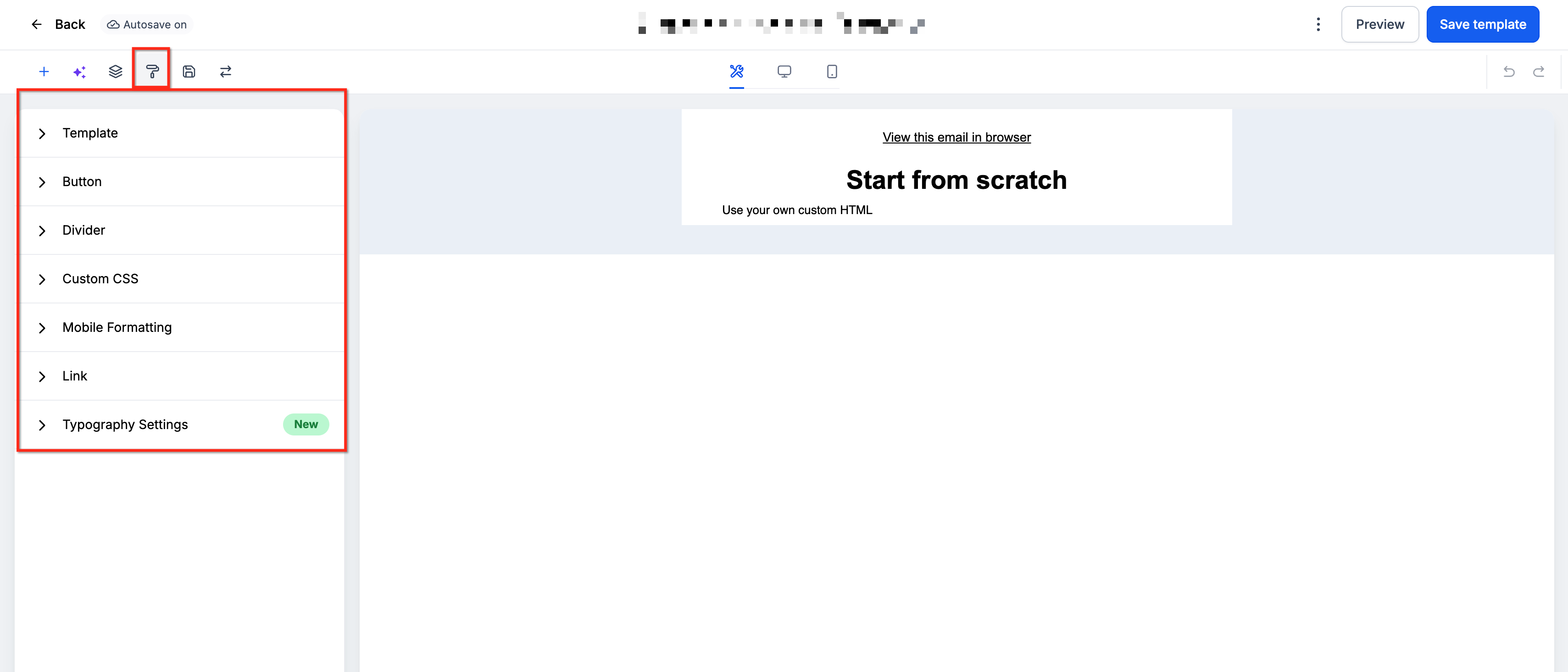
Locate the Mobile Formatting settings.
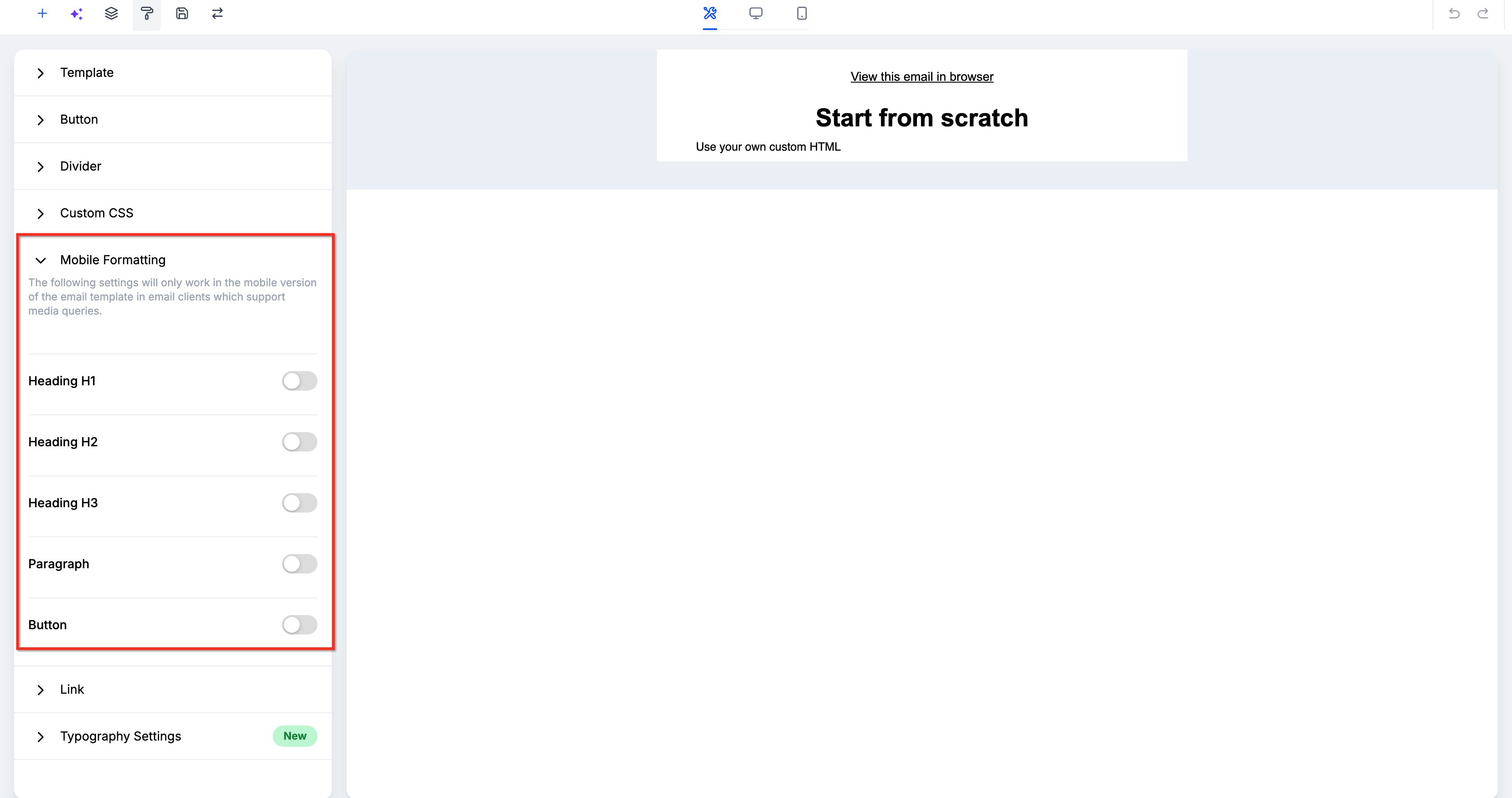
Review the available mobile-specific options.
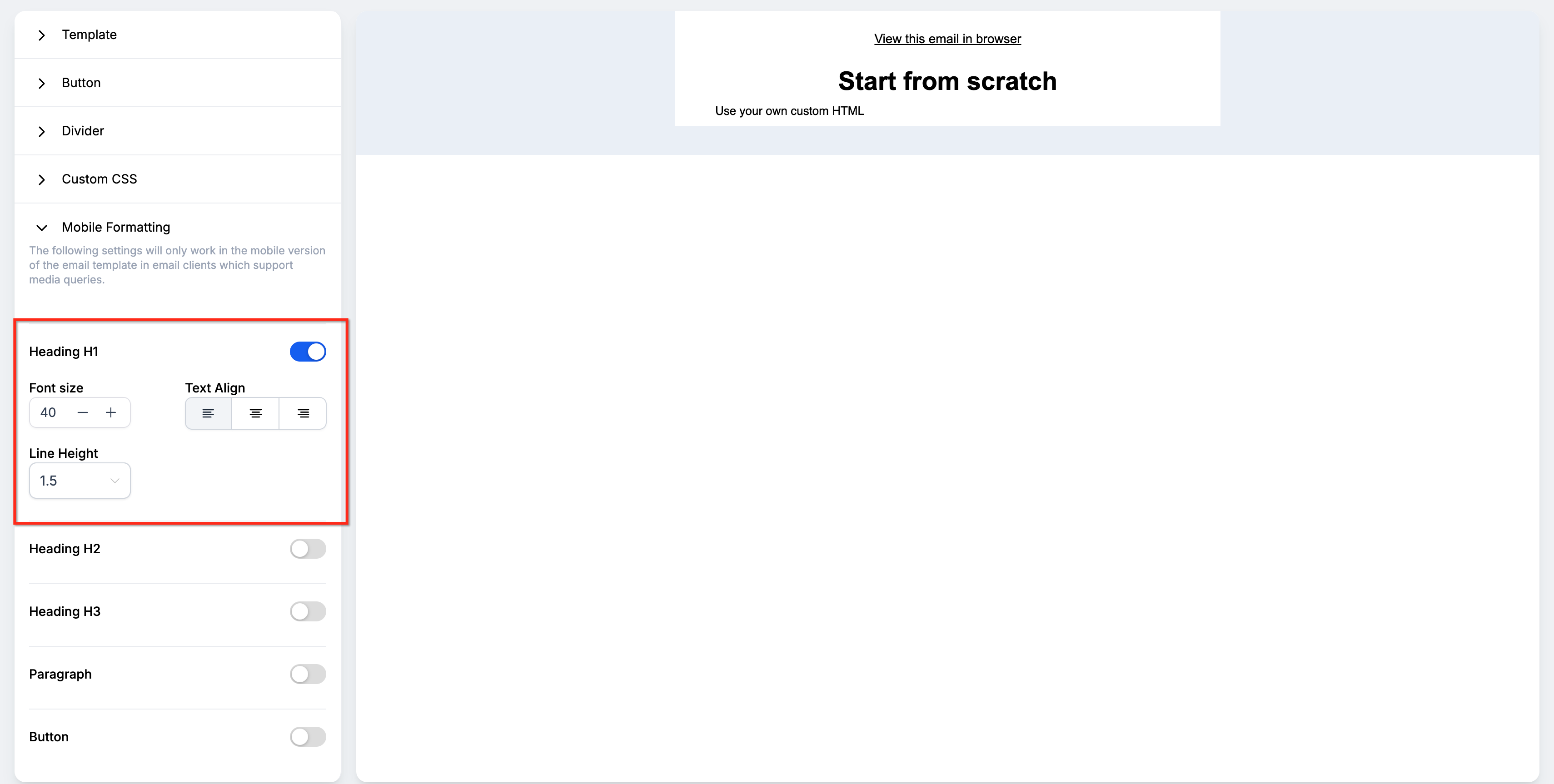
Enable the mobile override toggle for any setting you want to change independently from the desktop version.
Adjust the required values, such as:
Font size
Line height
Alignment
Button styling
Other available mobile controls
Review the email in mobile preview.
Make additional adjustments if text wraps poorly, buttons feel too small, or spacing looks crowded.
Save the email.
How to Preview and Test Mobile Emails
Previewing helps you catch visual issues inside the builder, while a test send shows you how the email behaves in a real inbox. Both steps are important because email clients can render responsive styles differently.
Preview the Mobile Version
After saving your changes:
Open the email preview.
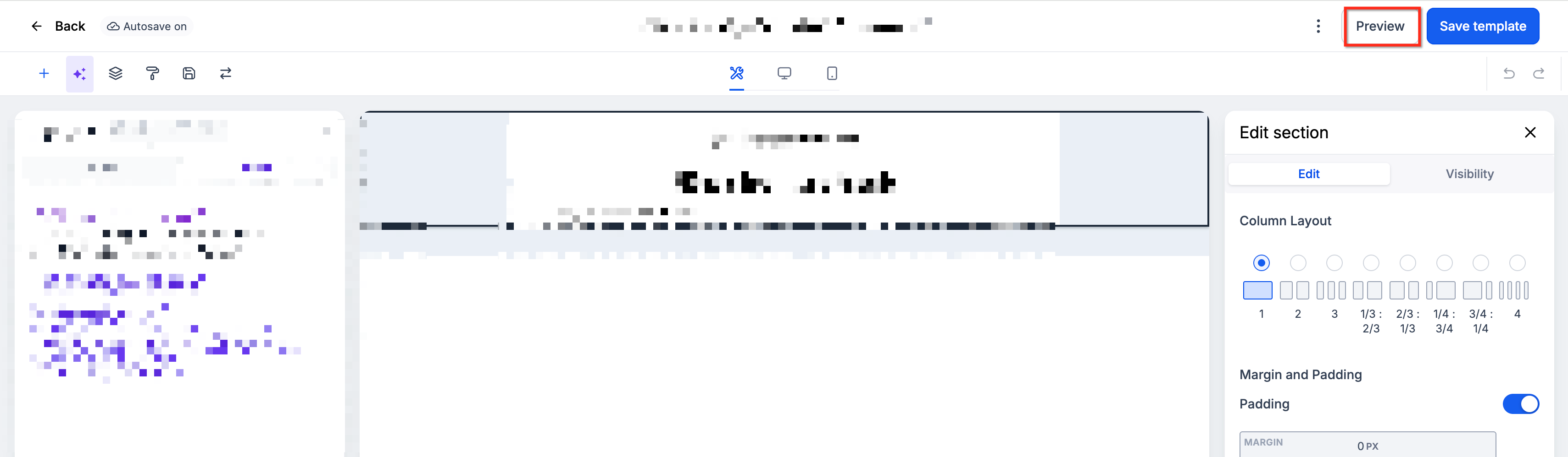
Switch to Mobile view.
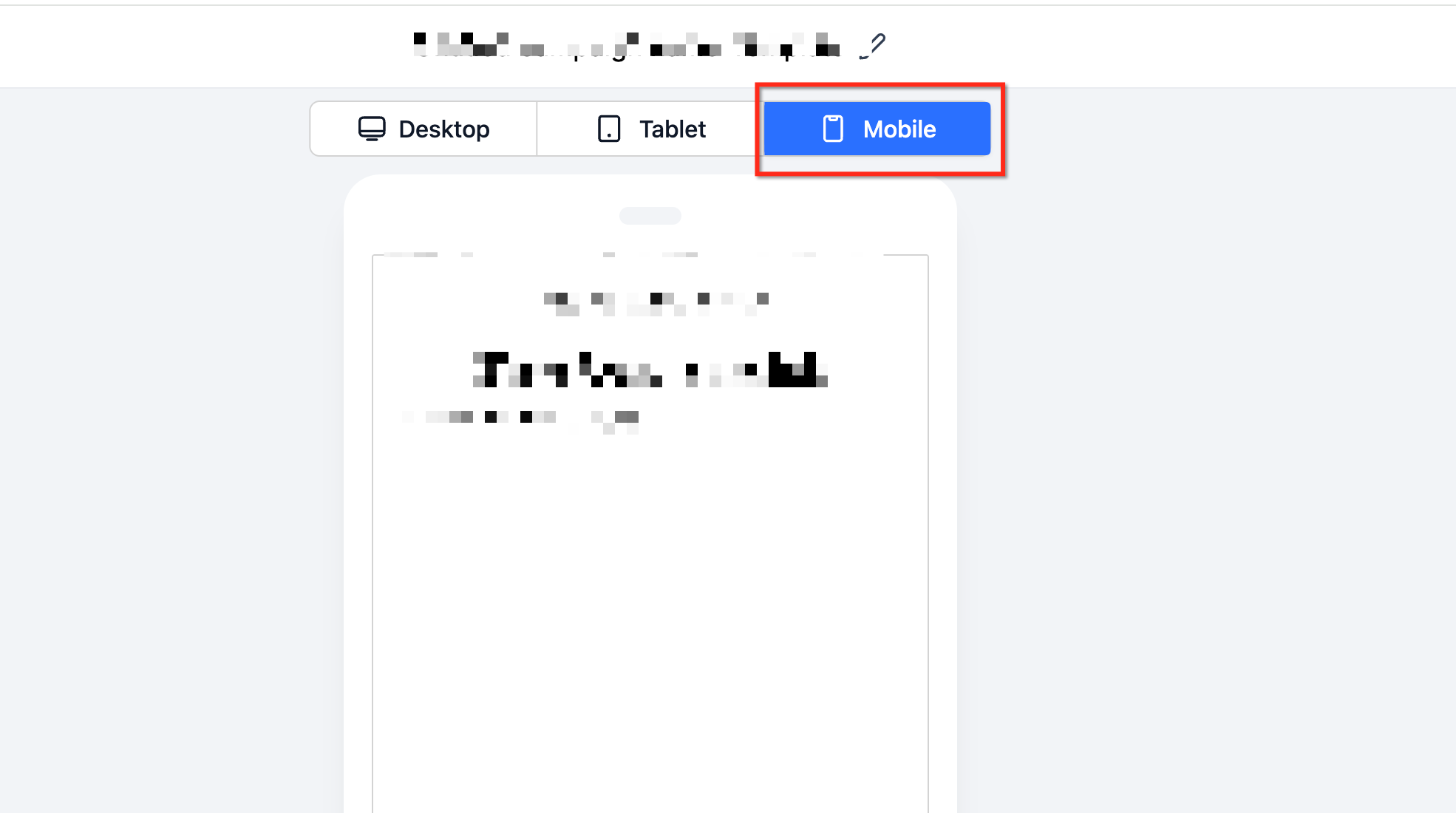
Review:
heading sizes,
body text,
line wrapping,
button widths,
alignment,
image scaling,
spacing,
hidden or visible content.
Send a Test Email
After previewing:
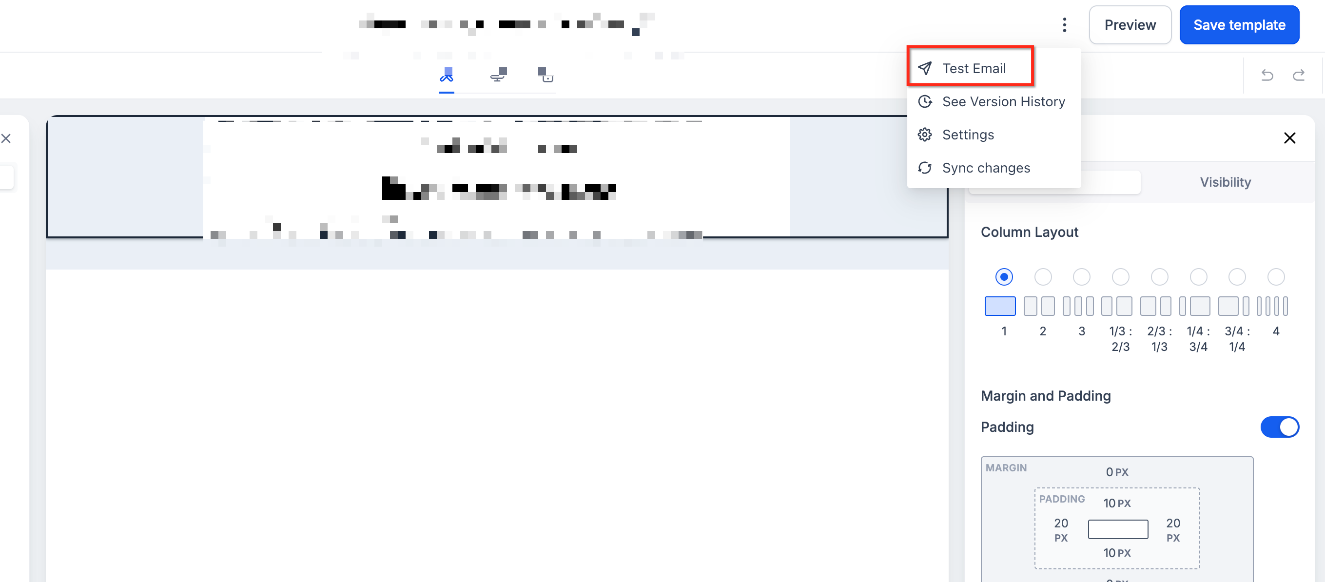
Use Test Email.
Send the email to one or more real inboxes.
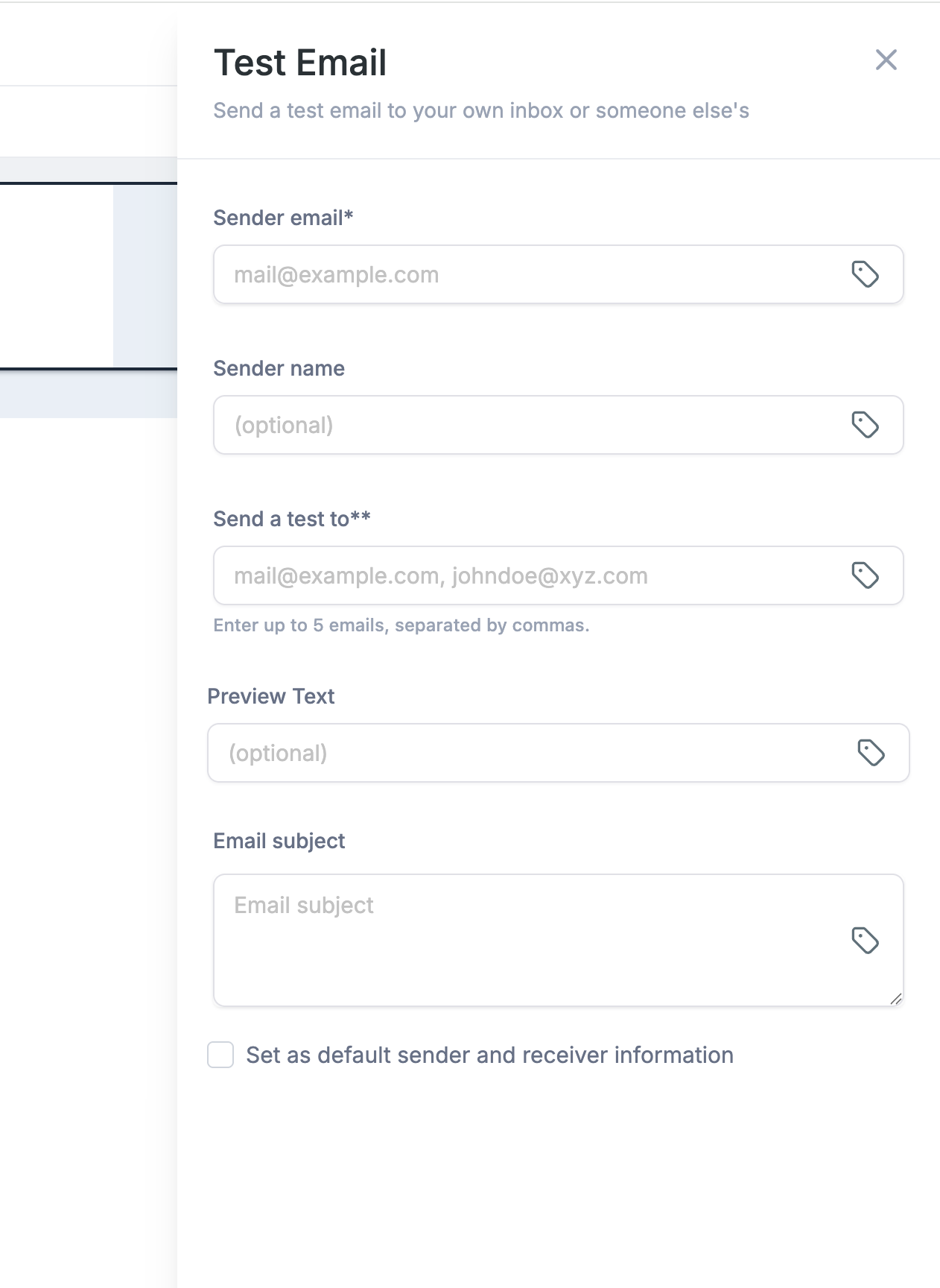
Open the test on relevant devices and email clients.
Frequently Asked Questions
Q: What happens if I do not enable a mobile override?
The mobile version uses the default/base styling for that setting. A separate mobile value only applies when the corresponding override is enabled.
Q: Do mobile settings affect the desktop version?
No. Mobile-specific overrides are designed to apply to the mobile rendition where supported, while desktop/default styling remains unchanged.
Q: Why is my mobile font size not changing?
Confirm that the mobile font-size override is enabled. Also remember that mobile-specific styling depends on email-client support for responsive CSS and media queries.
Q: Why does my received email look different from the mobile preview?
Email clients use different rendering engines and may handle responsive CSS differently. Always send a test email to confirm the actual inbox experience.
Q: Can I hide an element only on mobile?
Yes. Use Device Visibility controls when you want to hide or show an individual element by device type.
Q: Can I hide an entire layout on mobile?
Yes. Layout Visibility lets you control whether supported layout blocks appear on desktop or mobile.
Q: Is Mobile Formatting required for every email?
No. HighLevel email elements are responsive by default. Use Mobile Formatting when the default responsive behavior needs additional adjustment.
Q: Can I make a button look different on mobile?
Yes, where the available Mobile Formatting controls support button-specific overrides. Enable the relevant mobile setting and configure the mobile version separately.
Q: What happens if an email client does not support the mobile formatting?
The client may fall back to the default/base styling. Design the default version so the email remains readable and usable without mobile-specific overrides.
Q: Should I only use the mobile preview to test my email?
No. Use both builder preview and an actual test send because real inbox rendering can differ from the preview.
Related Articles
Was this article helpful?
That’s Great!
Thank you for your feedback
Sorry! We couldn't be helpful
Thank you for your feedback
Feedback sent
We appreciate your effort and will try to fix the article