Overview
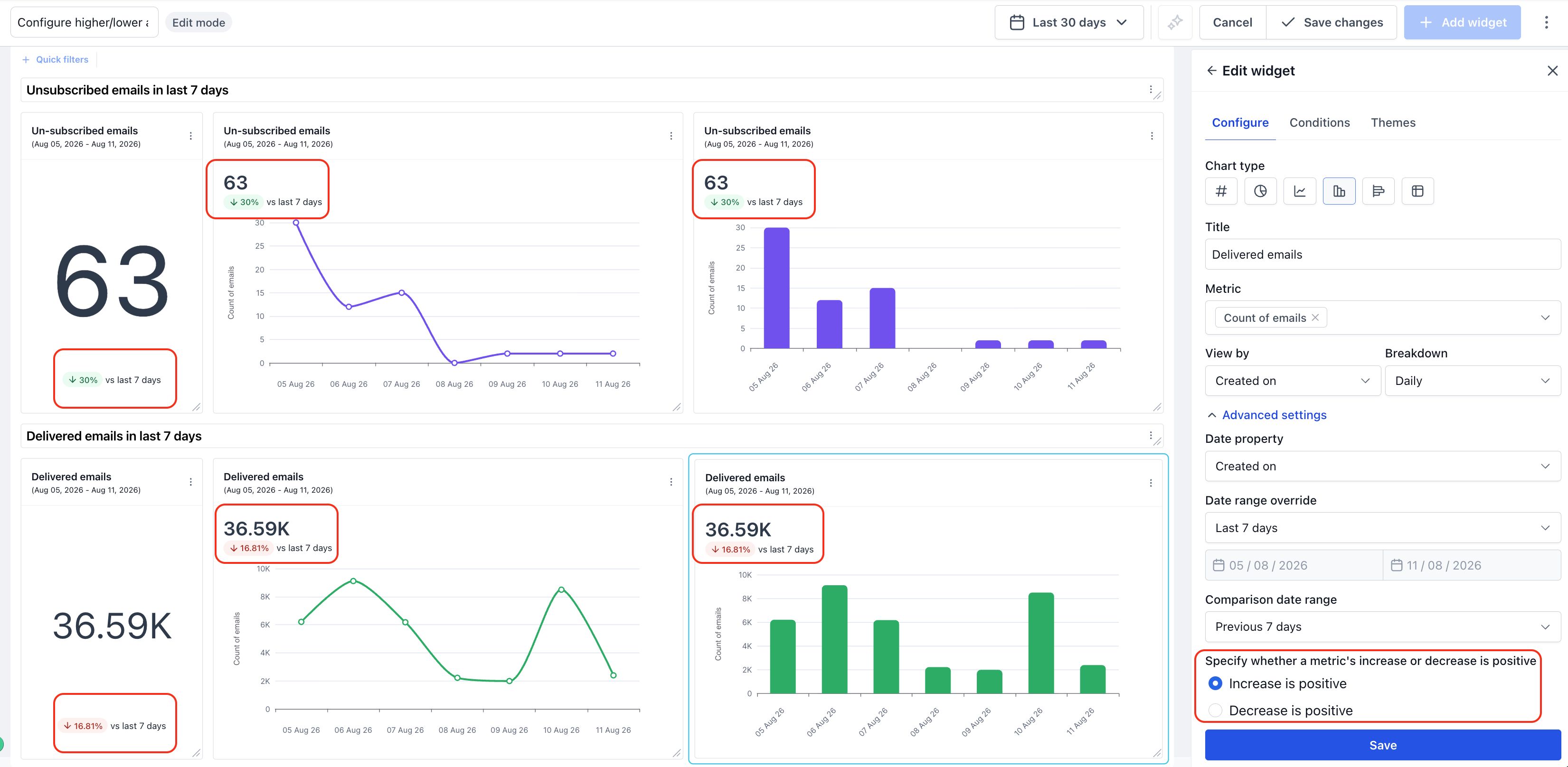
Every widget's number stat shows a small trend badge next to it — an up or down arrow with a percentage, like ↓30% vs last 7 days. By default, this badge turns green when a metric goes up and red when it goes down.
That works well for metrics like Delivered Emails, where more is better. But for metrics like Unsubscribed Emails, Bounce Rate, or Cost per Lead, a lower number is the good outcome — and a badge that turns red just because the number dropped would be misleading.
You can now tell each widget which direction should count as positive, so the trend badge always reflects reality.
Where to find it
- Open the dashboard or custom report containing the widget.
- Click the widget's menu (⋮) and select Edit widget, or open Edit mode and click into the widget.
- In the Configure tab, expand Advanced settings.
- Under Comparison date range, you'll see: Specify whether a metric's increase or decrease is positive
- Increase is positive (default) — the badge turns green when the value goes up, red when it goes down.
- Decrease is positive — the badge turns green when the value goes down, red when it goes up.
- Choose the option that matches how the metric should be read, then click Save changes.
Note: This setting only affects the trend badge. It requires a Comparison date range to be set (e.g., "Previous 7 days") — without a comparison range, there's no % change to color in the first place.
Examples
| Widget | Metric behavior | Recommended setting | Result |
|---|---|---|---|
| Unsubscribed Emails | Lower is better | Decrease is positive | A drop in unsubscribes shows green |
| Delivered Emails | Higher is better | Increase is positive | A drop in delivered emails shows red |
| Bounce Rate | Lower is better | Decrease is positive | A drop in bounce rate shows green |
| Cost per Lead | Lower is better | Decrease is positive | A drop in cost per lead shows green |
| Churn Rate | Lower is better | Decrease is positive | A drop in churn shows green |
Does this apply to all chart types?
The trend badge and this setting, behaves the same whether the widget is displayed as a Number, Line, or Bar chart.
Frequently asked questions
- Will this change how my existing widgets look? No. Every existing widget defaults to Increase is positive, matching the previous (only) behavior. Nothing changes unless you manually update a widget's setting.
- Is this available for custom metrics too? Custom metrics already have a similar "When the metric increases, show indicator as → Positive/Negative" toggle in its custom metrics builder.
- I don't see the trend badge at all — why? Make sure a Comparison date range (e.g., "Previous 7 days," "Previous period") is set for the widget. Without a comparison range, there's nothing to compare against, so no badge or delta appears.
- Where exactly is this setting located? Widget → Configure tab → Advanced settings → below Comparison date range.
Was this article helpful?
That’s Great!
Thank you for your feedback
Sorry! We couldn't be helpful
Thank you for your feedback
Feedback sent
We appreciate your effort and will try to fix the article