Product Media Layouts for the Product Details Page in HighLevel
Modified on: Thu, 25 Jun, 2026 at 12:17 AM
Give your product pages a more polished and flexible look with new media layout options in HighLevel. Merchants can now choose how product images appear on the Product Details Page to better match their brand, highlight product details, and improve the shopper experience. These layout options also help create a smoother browsing experience across desktop and mobile devices.
TABLE OF CONTENTS
- What is Product Media Layout on the Product Details Page?
- Key Benefits of Product Media Layouts
- Mobile Layout Behavior
- How To Setup Product Media Layouts
- Frequently Asked Questions
- Related Articles
What is Product Media Layout on the Product Details Page?
Product Media Layout controls how product images are displayed on the Product Details Page in HighLevel. This gives store owners more flexibility in how shoppers view product photos, compare product details, and move through a product gallery. Choosing the right layout can make product pages easier to browse and more visually engaging, especially for products with multiple images.
HighLevel now supports multiple layout styles for product media on the Product Details Page. These layouts help merchants present product images in a way that fits their store design while improving how customers interact with product visuals.
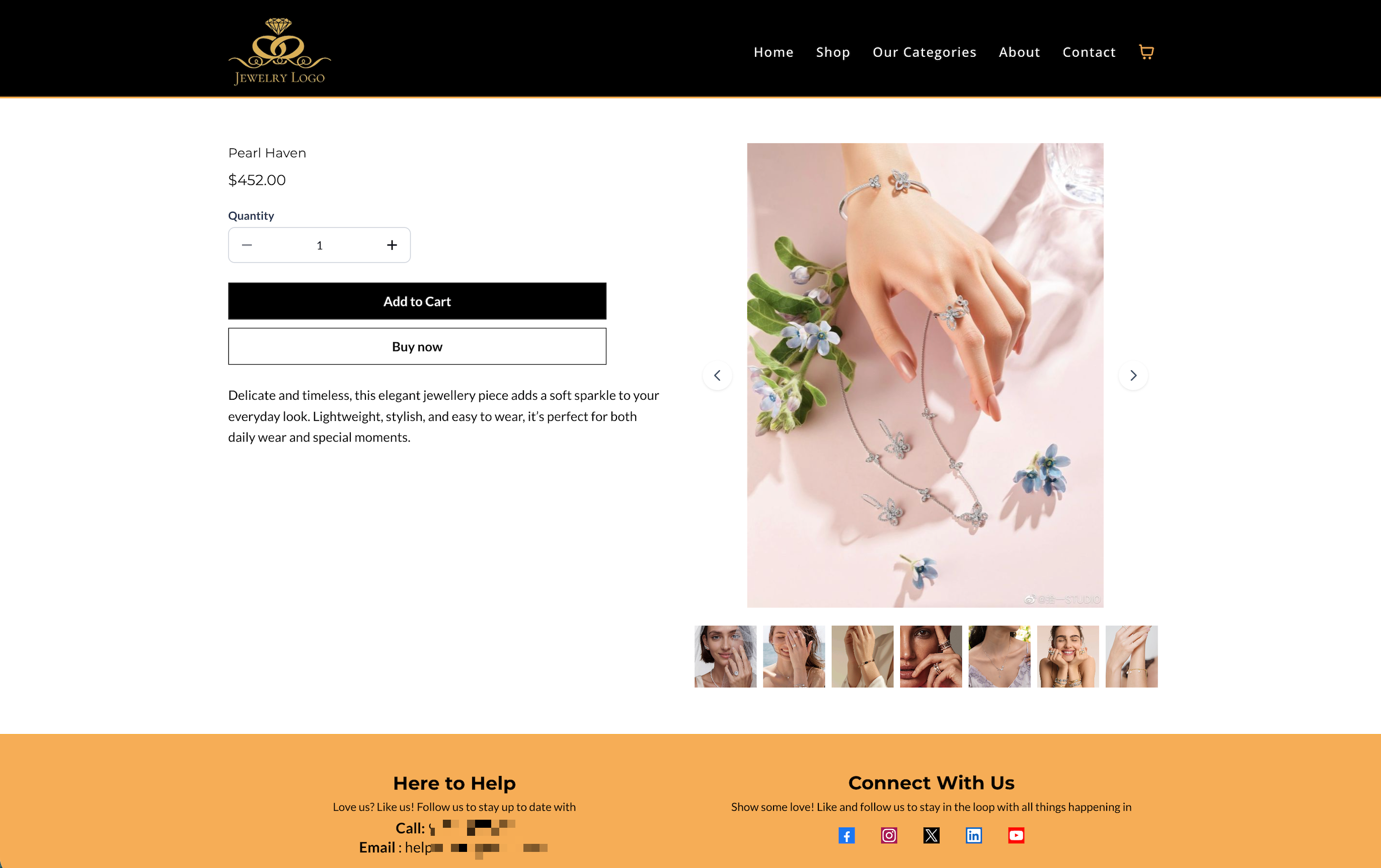
Variant Image Sync Behavior

Product variants and product images are connected on the Product Details Page.

When a customer selects a variant, HighLevel automatically selects the image assigned to that variant, when available. The assigned image becomes the active image in the product gallery or carousel.

This behavior works with Stack Carousel and Stack Gallery layouts. Two-Column layout behavior remains unchanged.

If the selected variant does not have an assigned image, the displayed image remains the same.

Selecting a product image does not change the selected variant, even when that image is assigned to a variant combination.
Key Benefits of Product Media Layouts
Choosing the right product media layout can improve how products are presented and make it easier for shoppers to explore images before making a purchase.
- More Flexible Product Presentation: Choose from multiple layout styles to match your storefront design and product type.
- Better Shopping Experience: Help customers browse product images more easily with improved layout and navigation options.
- Improved Visual Merchandising: Showcase product details more effectively with layouts that support different image viewing preferences.
- Optimized Mobile Viewing: Ensure a smoother mobile experience with Carousel automatically applied on mobile devices.
- Backward Compatibility: Keep existing stores visually consistent unless a layout is manually changed.
Mobile Layout Behavior
Mobile shoppers need a layout that is easy to browse, touch-friendly, and optimized for smaller screens. HighLevel automatically applies a mobile-friendly media experience to help ensure product images remain easy to view across devices.
On mobile devices, HighLevel automatically uses the Carousel layout for:
- Product Details Page
- Featured Product elements
- Mobile does not use the Two Column layout
- Carousel is applied on mobile regardless of the desktop media layout selected
- This helps maintain a better viewing experience on smaller screens
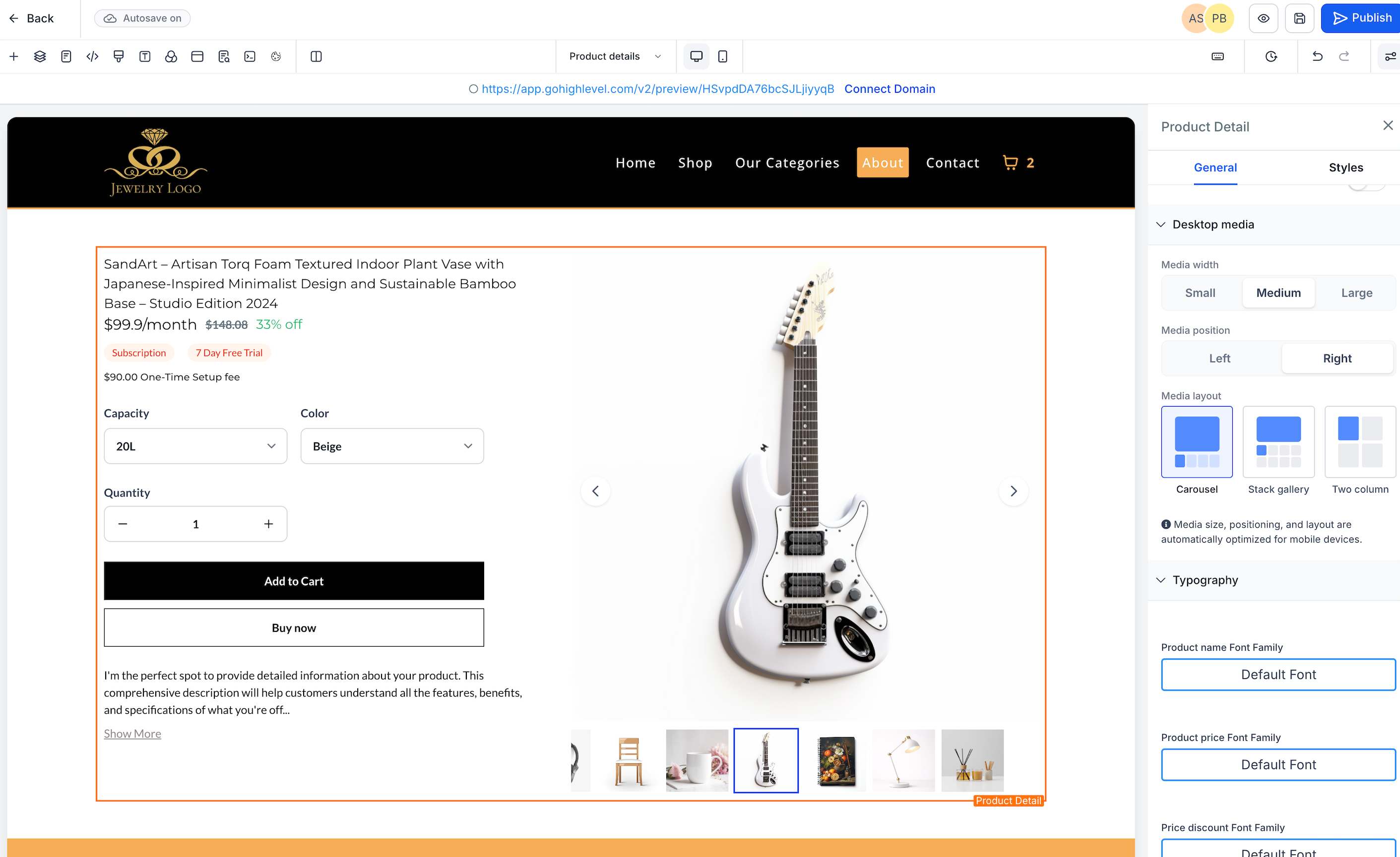
How To Setup Product Media Layouts
Selecting the right product media layout helps ensure your storefront presents product images clearly across desktop and mobile devices. Proper setup also helps avoid confusion around layout availability, navigation arrows, and mobile behavior.
- Open your Store Builder in HighLevel.

- Edit the Product Details Page.

- Select the Product element on the page.
- In the right-side settings panel, navigate to Desktop Media settings.

- Choose your preferred Media Layout:

- Gallery
- Carousel
- Two Column
- Gallery
- Save your changes.

- Publish the page to apply the new layout to your storefront.

Important Notes during Setup:
- Two Column is available only on desktop
- Carousel is automatically used on mobile
- Featured Product elements support only Gallery and Carousel
- Existing stores keep their current layout unless you manually update it
- Existing stores continue using Gallery by default for backward compatibility
[H2] Customize Desktop Media Size
Desktop media sizing helps you control how prominently product images appear on the Product Details Page. This makes it easier to match product presentation to your storefront style while keeping the layout balanced and readable.
In the Product Details element, you can now choose a desktop Media width for the product media area.
Available options include:
- Small
- Medium
- Large
These settings apply to the desktop Product Details Page only.
Change Desktop Media Position
Desktop media positioning lets you control whether product images appear before or after the product details content. This helps create a clearer visual hierarchy and gives you more flexibility when designing your storefront.
You can set the Media position to:
- Left
- Right
This changes where the product media section appears relative to the product name, pricing, selectors, and purchase buttons on desktop.
Desktop and Mobile Behavior
Desktop Product Details customization controls are designed to improve layout flexibility without breaking responsiveness on smaller screens. This helps ensure product pages remain usable across devices.
Important:
- These customization settings affect desktop layouts only
- On mobile and tablet, the Product Details Page continues to stack vertically for responsive behavior
- Image scaling stays within safe display boundaries to help prevent distortion
Frequently Asked Questions
Q: Will existing stores automatically switch to a new media layout?
A: No. Existing stores keep their current layout unless you manually change it.
Q: What layout do existing stores use by default?
A: Existing stores continue using the Gallery layout for backward compatibility.
Q: Why does my mobile product page use Carousel even though I selected Two Column on desktop?
A: HighLevel automatically applies Carousel on mobile to provide a better viewing experience on smaller screens.
Q: Can I use Two Column in a Featured Product element?
A: No. Featured Product elements support only Gallery and Carousel.
Q: Why are navigation arrows missing in the Two Column layout?
A: Navigation arrows are not supported in the Two Column layout.
Q: Do Gallery and Carousel both support navigation arrows?
A: Yes. Navigation arrows are available in both Gallery and Carousel layouts.
Q: Do I need to update each product individually to use a new layout?
A: No. The layout is configured in the Product element settings on the Product Details Page.
Q: Is Two Column available on mobile devices?
A: No. Two Column is a desktop-only layout.
Q: Does Image Zoom work with all Product Media layouts?
A. Yes. Image Zoom works with Gallery, Carousel, and Two Column media layouts on desktop.
Related Articles
- Custom Product Details Page (PDP) for HighLevel Stores
- How to Set Up an E-Commerce Online Store (Websites)
- Getting Started - Create & Sell Products
- Related Product element for Ecommerce stores
- Text Customization in Ecommerce Stores
Was this article helpful?
That’s Great!
Thank you for your feedback
Sorry! We couldn't be helpful
Thank you for your feedback
Feedback sent
We appreciate your effort and will try to fix the article