This article introduces HighLevel’s revamped right-hand sidebar in the Funnel & Website Builder, showcasing how its three context-aware tabs- General, Styles, and Animations- organize element controls for faster, more intuitive editing. You’ll learn what each tab offers, discover collapsible panels and persistent states that streamline your workflow, and find tips for getting the most out of the updated interface.
TABLE OF CONTENTS
- What Is the Revamped Sidebar?
- Key Benefits of the Revamped Sidebar
- Navigating through the New Revamped Sidebar Tabs
- Understanding Collapsible Panels
- Persistent Panel & Tab State Behavior
- UI Enhancements and Styling Improvements
- Frequently Asked Questions
- Next Steps
- Related Articles
What Is the Revamped Sidebar?
The revamped sidebar is a major UI refresh for the right-hand panel in HighLevel’s Funnel & Website Builder. It reorganizes controls into three main tabs, General, Styles, and Animations, and nests related settings into collapsible panels. Together, these changes reduce visual noise, help you find the right controls more quickly, and maintain your layout preferences as you move between elements and sessions.
Key Benefits of the Revamped Sidebar
This redesign improves the editing experience and overall builder performance by making style and layout adjustments more intuitive.
Faster Access to Controls: Locate content, style, and animation settings instantly via clear, dedicated tabs.
Cleaner Workspace: Collapsible panels group related settings, so you only see what you need.
Consistent Experience: The sidebar “remembers” your last-used tab and panel states during your session.
Modern Minimal UI: Updated spacing, typography, and icons create a lighter, less overwhelming interface.
Enhanced Usability: Whether you’re new to the builder or an experienced user, intuitive organization speeds up your workflow.
Navigating through the New Revamped Sidebar Tabs
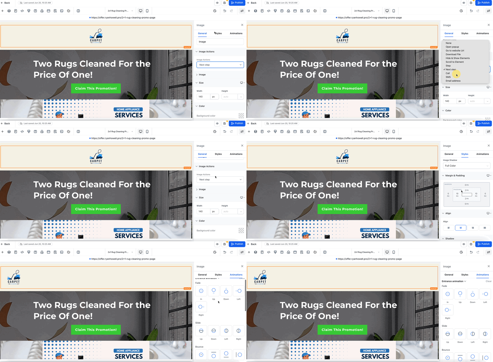
With the new right-hand sidebar, all of your element controls are now organized into three clear, context-aware tabs: General, Styles, and Animations. Switching between these tabs lets you quickly access content settings, layout and styling options, or motion controls without wading through unrelated panels.
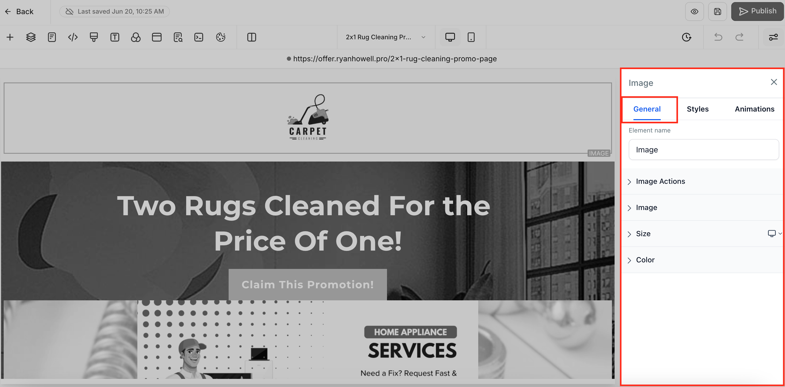
1. General Tab
In the General tab, you’ll find everything you need to adjust an element’s core content and behavior. At the top sits the Element Name field, which you can use to rename layers (for example, changing “Headline” to “Hero Title” for clearer organization). Directly below are the Element Options, which vary by element type and include text fields for headlines, URL inputs for buttons and links, alt-text for images, and labels for form fields. You’ll also see Element Actions, where you assign interactions like On click, Navigate to URL, Submit form, or Open lightbox. Further down, the tab exposes Typography settings, choose your font family, adjust font size and weight, and set opacity, alongside controls for Line Height, Letter Spacing, text transforms (uppercase/lowercase), and even rotation or skew. Finally, a suite of Color Controls lets you pick background colors, text colors, link hues, and icon tints with either a color picker or custom hex value.
2. Styles Tab
The Styles tab is where you fine-tune an element’s layout and visual appearance across all device breakpoints. At a glance, you can adjust Margin (outer spacing) and Padding (inner spacing) to control how the element sits relative to its neighbors, and configure a Border by setting width, style (solid/dashed/dotted), corner radius, and color. Align options let you choose text alignment (left/center/right/justify) or object alignment for images and other blocks. The Visibility panel lets you independently show or hide the element on desktop, tablet, or mobile. For text elements, open the Text Shadow panel to add a drop shadow by specifying horizontal/vertical offsets, blur radius, and shadow color. At the bottom, use the Custom Class field and CSS Selector to tag the element for any custom styling or scripting you might add later.

3. Animations Tab
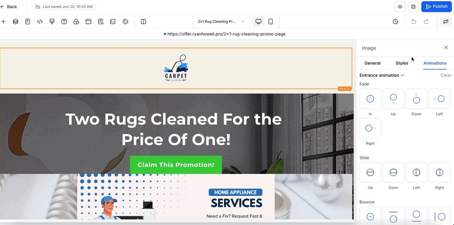
The Animations tab lets you add motion and interactive effects to supported elements in the Funnel & Website Builder. The options available depend on the element you select.
For supported elements, you can configure:
- Entrance Animation: Apply effects that animate the element as it comes into view.
- Infinite Loop: Add continuous animation effects where supported.
- Hover Animation: When a Button is selected, you can preview and apply built-in hover effects directly from the sidebar.
For Button hover animations, select an effect under Hover Animation, then use Adjust Animation to customize supported settings such as Duration, Delay, Easing, and effect-specific controls.
Depending on the selected hover effect, additional controls can include Scale, Angle, Distance, Fill Color, Border Color, Border Thickness, Blur, or Spread.
For complete Button hover-animation setup and customization options, see Animation Customizations in Funnels & Websites.
IMPORTANT: The exact settings available in the sidebar depend on the selected element. For example, Buttons can include Hover Animation controls, while other elements may show different animation, styling, or validation options.Understanding Collapsible Panels
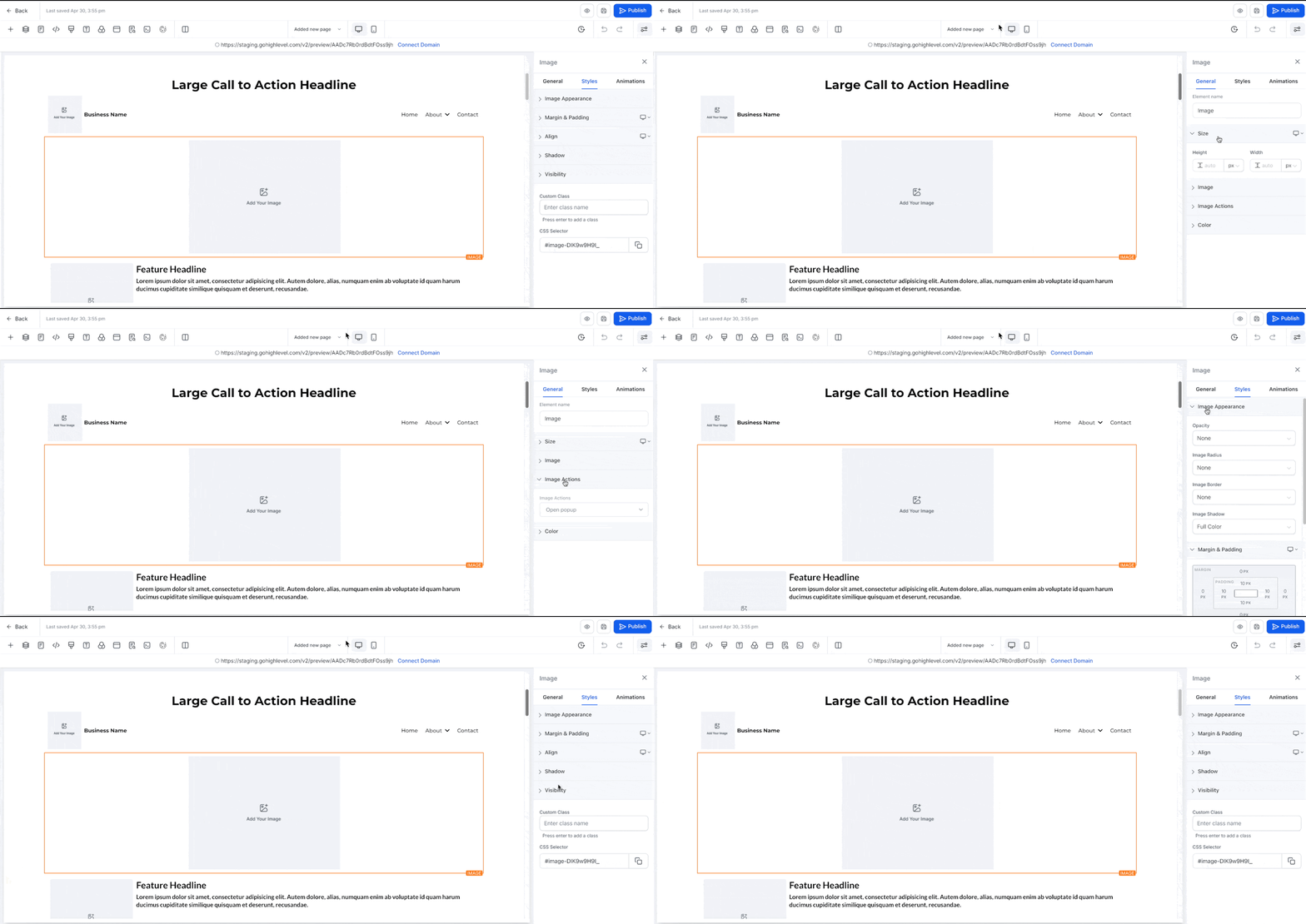
To improve focus and minimize distractions, settings within each tab are now grouped into collapsible panels.
- You can open or close individual panels as needed.
- Panels retain their state throughout your editing session.
- Advanced or less-used settings can stay collapsed for a cleaner view.
This provides a more organized workspace, especially during complex builds.
Persistent Panel & Tab State Behavior
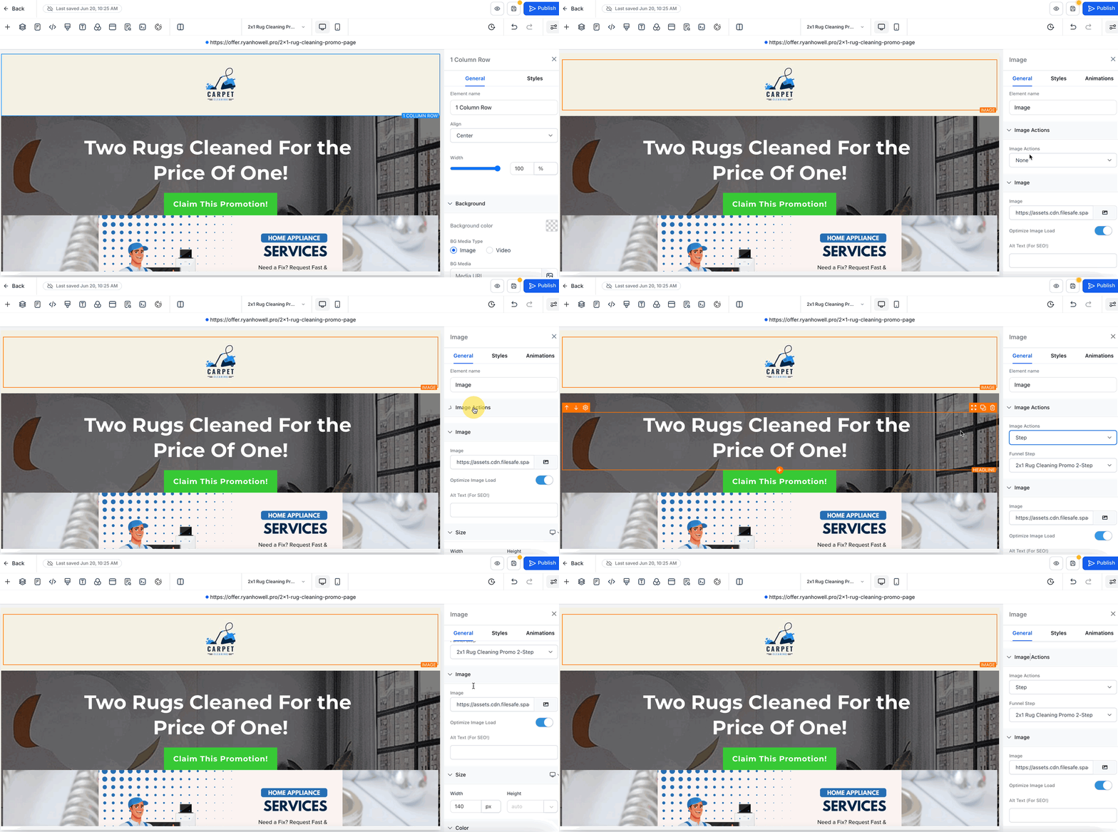
The updated sidebar improves efficiency with smart, session-based memory for tabs and panels.
- Tab memory: The last active tab remains selected when switching between elements.
- Panel memory: Collapsed or expanded states persist as you move through elements.
- New element behavior: When adding a new element, all panels open by default to help with quick access.
These enhancements eliminate the need to repeatedly open panels or tabs, saving time during design iterations.
UI Enhancements and Styling Improvements
This revamp introduces a minimal, modern aesthetic that aligns with HighLevel’s broader interface improvements.
- Reduced visual noise with improved spacing and layout.
- Uniform styling and spacing between controls.
- Cleaner typography and simplified icons.
- Consistent design patterns across the builder
All of these changes aim to reduce mental fatigue and help users stay focused while designing funnels and web pages.
Frequently Asked Questions
Q: Will this update affect my existing funnels or website styling?
No. Your live designs remain unchanged. This update only improves the design interface.
Q. Will my previous settings be affected?
No. Only the sidebar’s UI layout changes; your element settings remain intact.
Q: Does the new sidebar impact performance?
Yes, positively. The layout is optimized for smoother navigation and faster adjustments.
Q: Are animation controls different depending on the selected element?
Yes. The Animations tab is context-aware, so available controls depend on the selected element. For example, Buttons can include Hover Animation controls in addition to supported entrance and loop animations.
Next Steps
- Begin editing elements using the new tab structure to get familiar with the flow.
- Collapse panels you use less frequently to create a cleaner workspace.
- Take advantage of persistent states to speed up your design sessions.
Related Articles
Was this article helpful?
That’s Great!
Thank you for your feedback
Sorry! We couldn't be helpful
Thank you for your feedback
Feedback sent
We appreciate your effort and will try to fix the article