This article explains how to use Animation Customizations within Funnels & Websites to enhance your page designs. You’ll learn how to control how elements animate by adjusting timing, easing, and effect-specific settings directly from the Page Builder. You can also add configurable hover animations to Button elements without custom CSS. Whether you’re creating a landing page, funnel, or full website, these tools help you create smooth, interactive experiences directly inside HighLevel.
TABLE OF CONTENTS
- What is Animation Customizations in Funnels & Websites?
- Animation Delay Behavior Enhancement
- Key Benefits of Animation Customizations
- How to Set Up Animation Customizations
- Frequently Asked Questions
- Related Articles
What is Animation Customizations in Funnels & Websites?
Animation Customizations is a built-in feature in the Page Builder that allows you to control how individual elements animate across your funnels and websites. It provides dedicated animation controls for adjusting timing, movement, easing, and other supported properties with real-time preview. This makes it easier to create polished motion and interactions without leaving the editor or adding custom code.
Available animation controls can include:
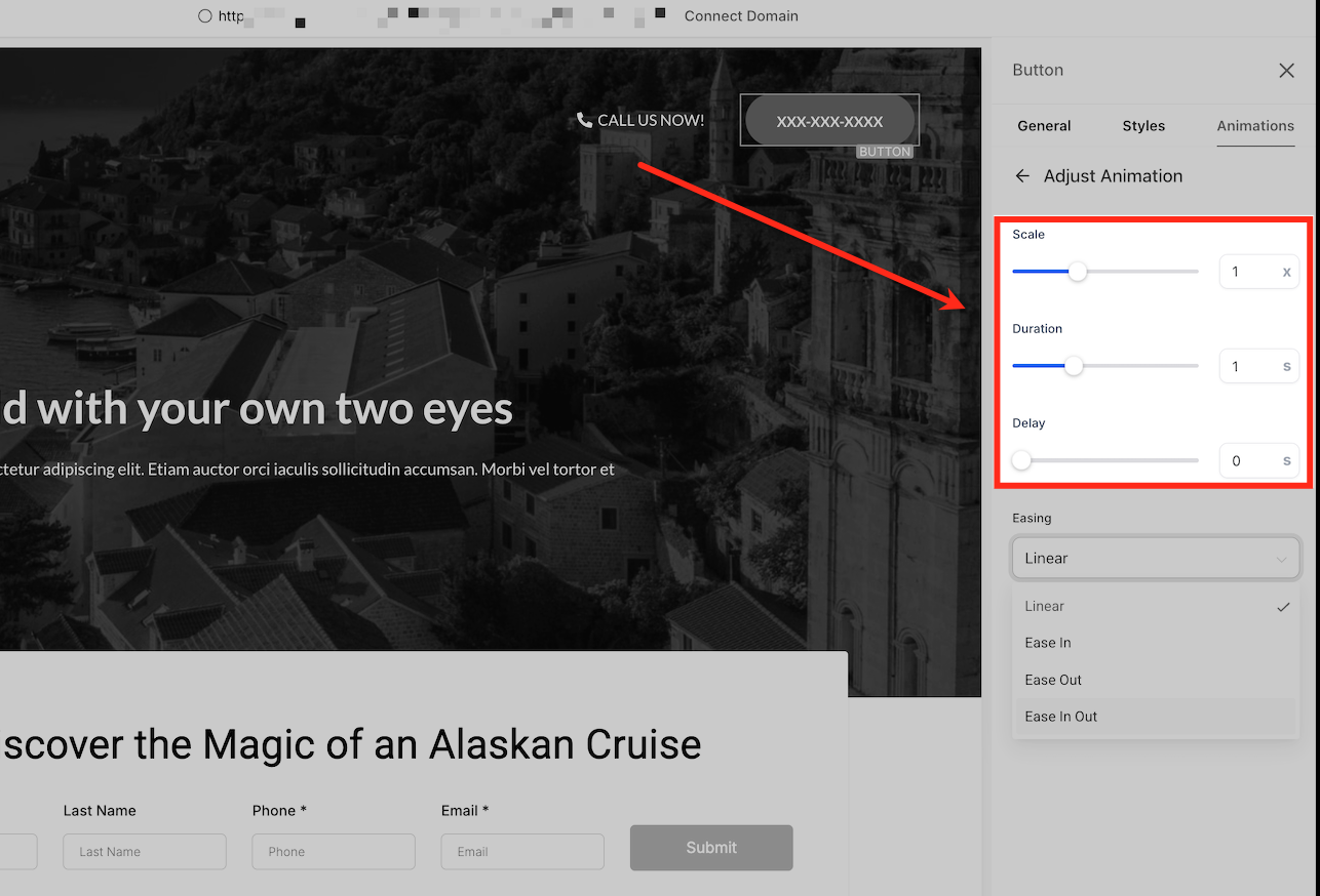
Scale: Adjusts the size of supported animation effects, with values from 0.5× to 2×.
Duration: Sets how long the animation takes, from 0.1 to 3 seconds.
Delay: Adds up to 5 seconds before the animation begins.
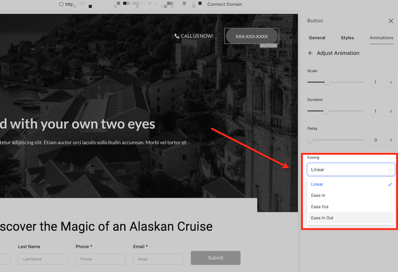
Easing: Choose from Linear, Ease-In, Ease-Out, and Ease-In-Out to control how the animation accelerates and slows.
For Button elements, you can also apply configurable hover animations from the Animations tab. Hover effects can be previewed directly on the canvas and customized with timing controls and effect-specific settings such as scale, angle, distance, color, border, or shadow.
These controls give you more flexibility to create interactive Buttons and polished page animations while keeping the experience editable inside the HighLevel Page Builder.
Animation Delay Behavior Enhancement
Animation delays function more accurately across funnels and websites. Elements remain hidden during the configured delay period and become visible when the animation begins.
Previously, certain elements could briefly appear before the delay completed. This behavior has been corrected to provide smoother, more visually consistent animations, especially when using staggered animation sequences.
Entrance animations also wait until the element is in view before playing and no longer restart during common builder editing actions such as drag-and-drop, switching device views, or editing the element.
No additional configuration is required. Existing animation settings automatically follow the improved behavior.
Key Benefits of Animation Customizations
Animation Customizations help you create purposeful motion and interactive Button states directly in the Page Builder. These controls make it easier to refine page interactions without custom CSS.
Granular control: Adjust timing, easing, and effect-specific properties to fine-tune how animations behave.
Configurable Button hover effects: Add interactive hover states directly from the sidebar without writing or maintaining custom CSS.
Real-time preview: Preview animation effects on the selected element before applying them and see adjustments directly on the canvas.
Effect-specific settings: See only the controls that apply to the selected hover effect, such as scale, distance, fill color, border thickness, or shadow settings.
Professional polish: Use motion and hover interactions to guide attention and make calls to action feel more interactive.
Together, these capabilities help you create smooth, high-impact animations while keeping the configuration inside the HighLevel Page Builder.
How to Set Up Animation Customizations
Use the Page Builder to apply entrance animations to supported elements and configure hover animations for Button elements.
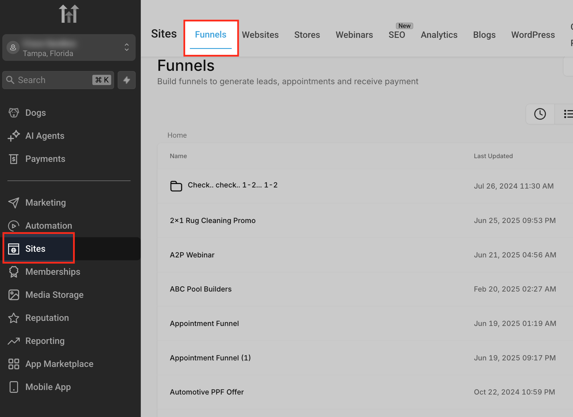
Access the Funnels Section
From the Sub-Account View, go to Sites → Funnels. This opens the list of funnel projects available in the sub-account.
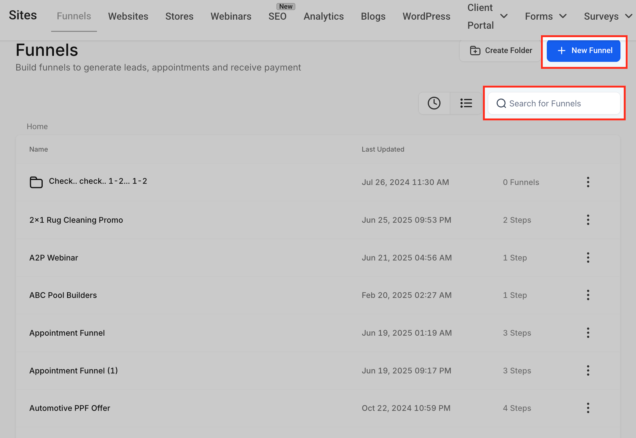
Choose or Create a Funnel
Use the Search for Funnels bar to open an existing funnel, or click + New Funnel to create one. This opens the Funnel Steps screen where you can manage and edit each funnel step.
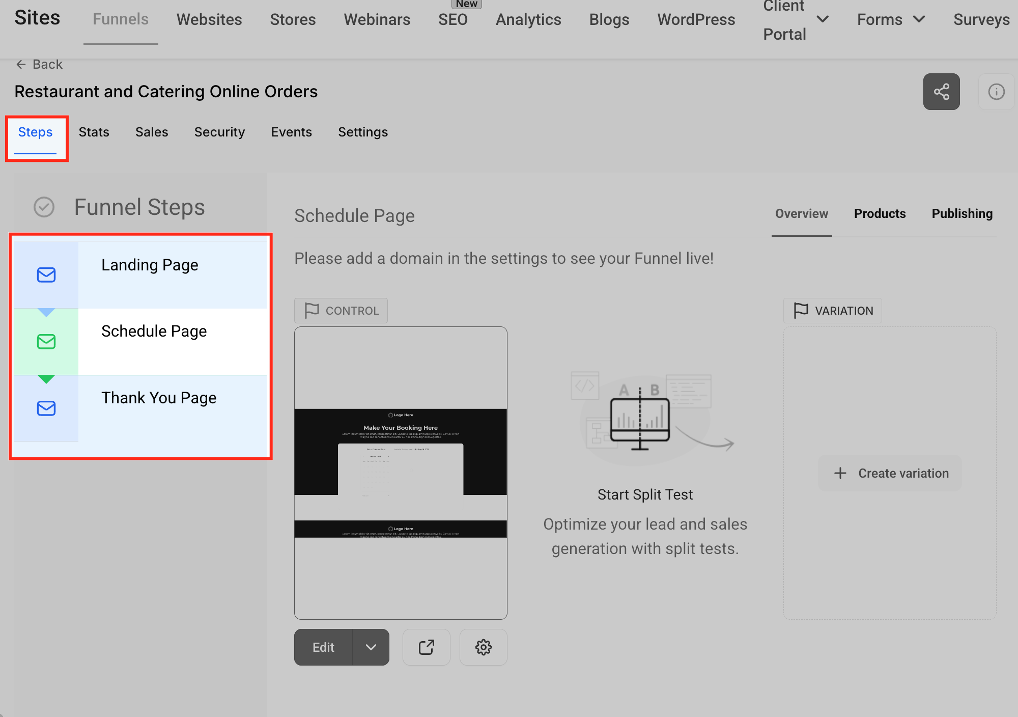
Select the Page to Animate
From the list of funnel steps, select the page where you want to configure animations. This loads the selected page preview and its available editing options.
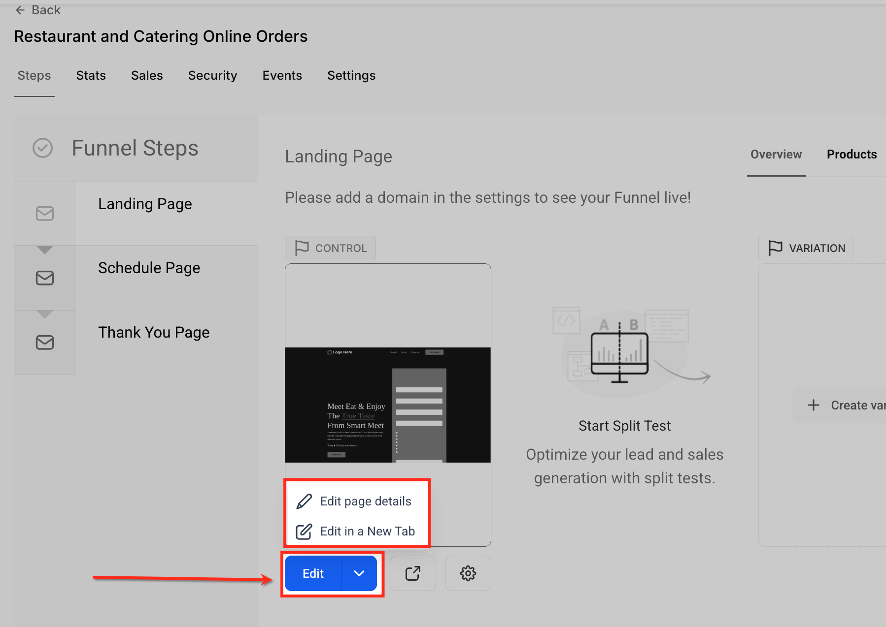
Open the Page Editor
Click the Edit button below the selected page preview, then choose Edit in a New Tab. This opens the page in the Page Builder.
Select the Element to Animate
Select the element you want to animate, such as a Button, text block, or image. The element settings appear in the right sidebar.
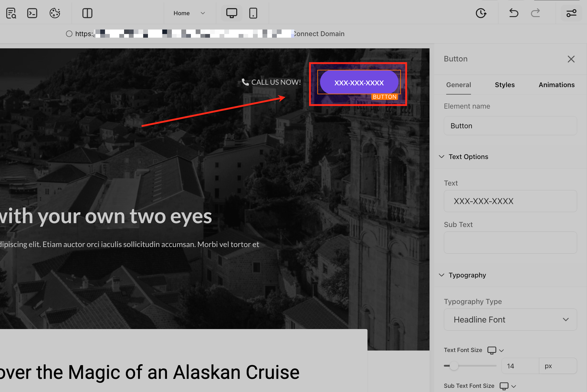
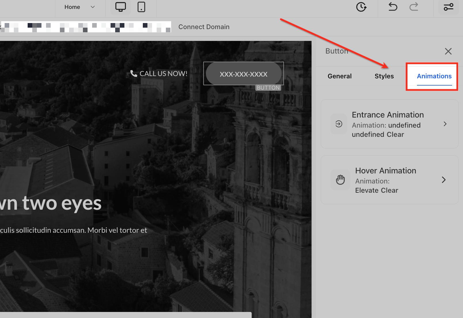
Open Animation Settings
With the element selected, open the Animations tab in the right sidebar. This is where you can manage available entrance and hover animation settings for the selected element.
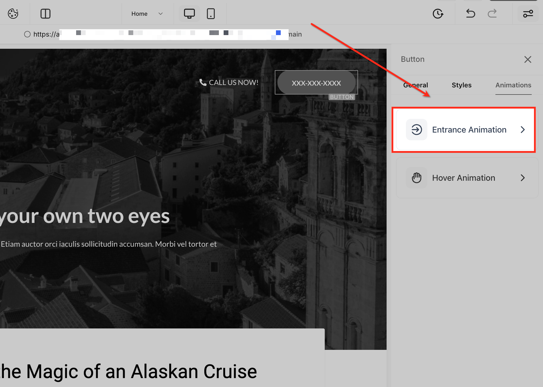
Select Entrance Animation
Click Entrance Animation to customize how the selected element appears when it enters the page. This opens the available entrance animation styles.
Choose an Animation Style
Browse the available animation options under Fade, Slide, Bounce, and other available groups. Select an animation to preview how the element enters the page.
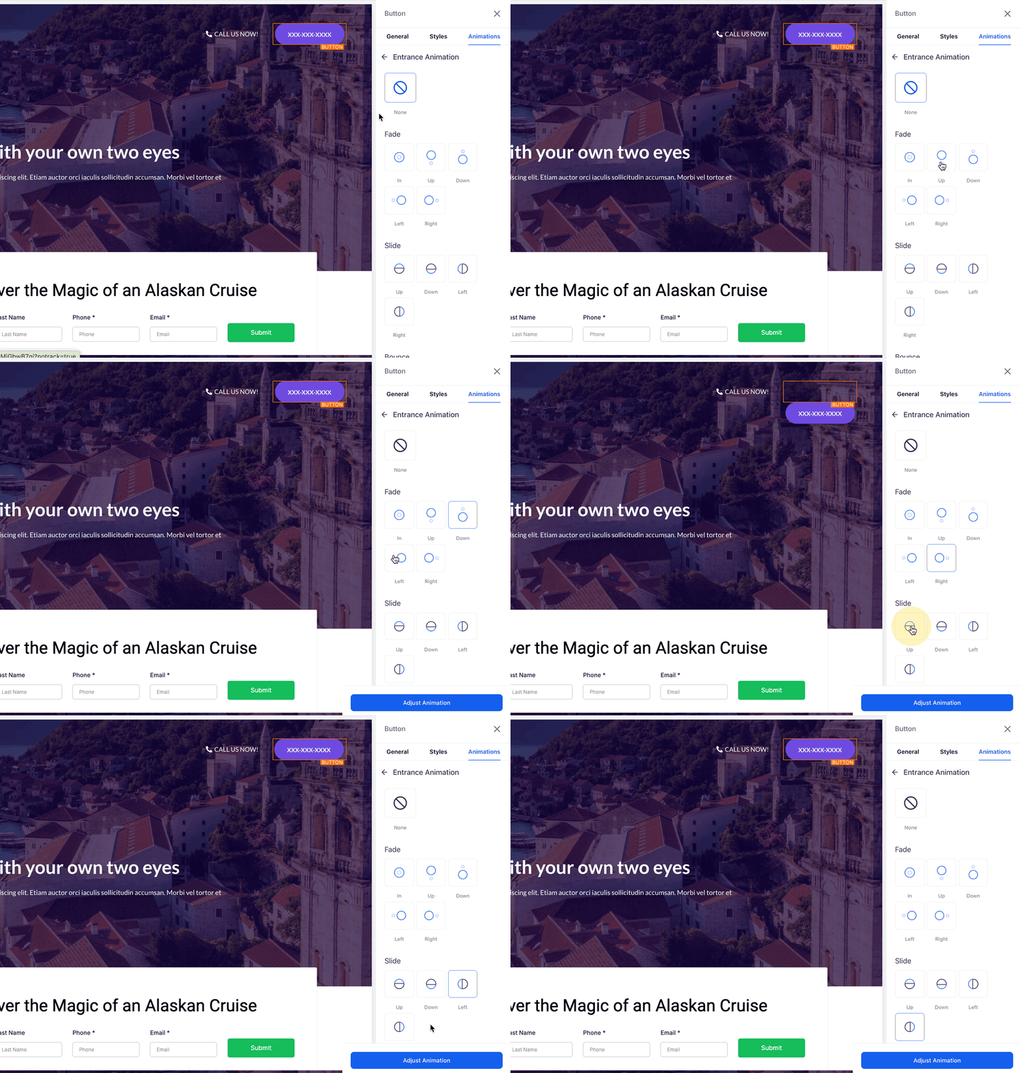
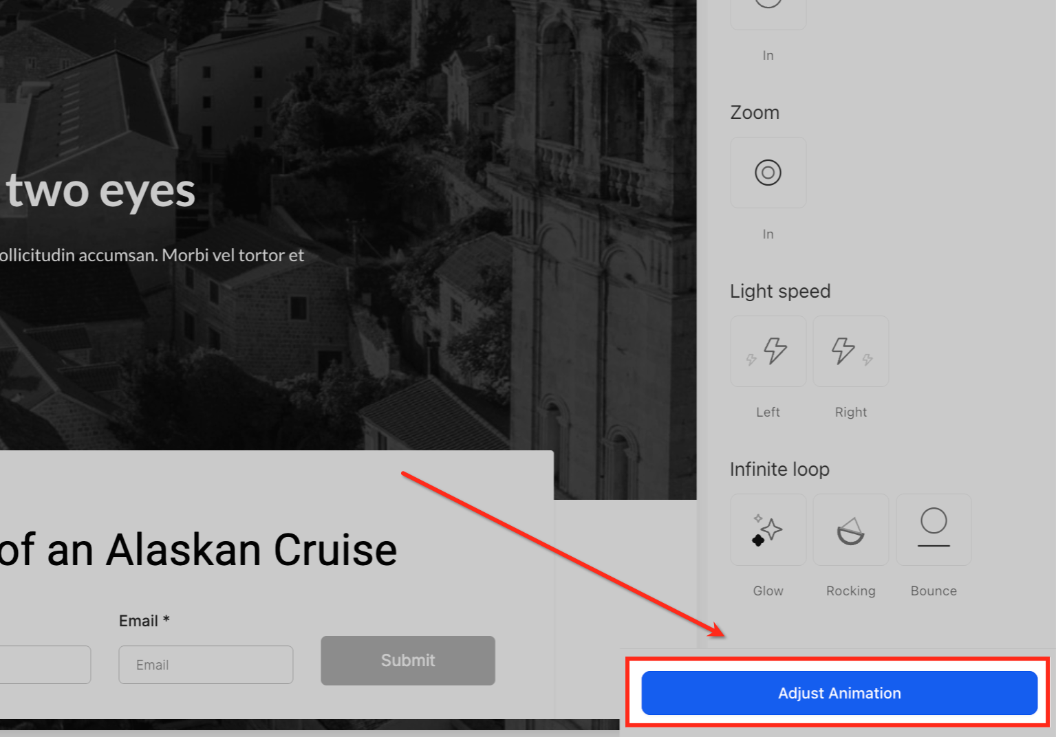
Click Adjust Animation
After selecting an animation style, click Adjust Animation. This opens the available settings for fine-tuning the animation.
Fine-Tune Animation Behavior
Use the available controls to adjust properties such as Scale, Duration, Delay, and Easing. The available controls depend on the selected animation.
Adjust Easing Behavior
Open the Easing dropdown to control how the animation accelerates and slows. Choose from Linear, Ease In, Ease Out, or Ease In Out.
Configure a Button Hover Animation
Hover animations give Buttons a visual response when a visitor points to them. Use the built-in hover effects to create interactive call-to-action states directly from the Page Builder without adding custom CSS.
In the Page Builder, select the Button you want to animate.
In the right sidebar, open the Animations tab.
Click Hover Animation.
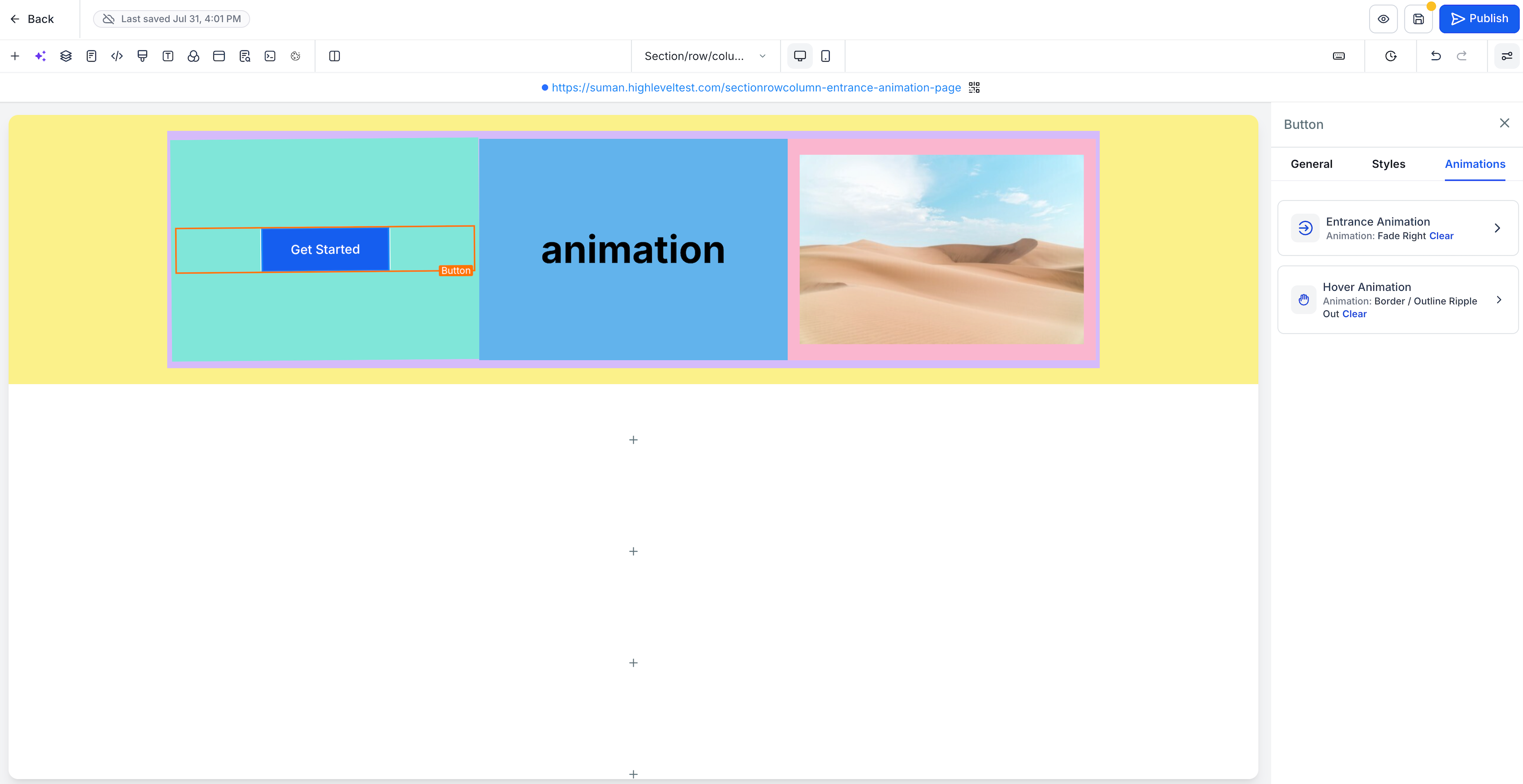
Browse the available hover effects. Hover over an effect card to preview the animation on the selected Button before applying it.
Select the hover effect you want to apply.
Click Adjust Animation to open the settings for the selected effect.
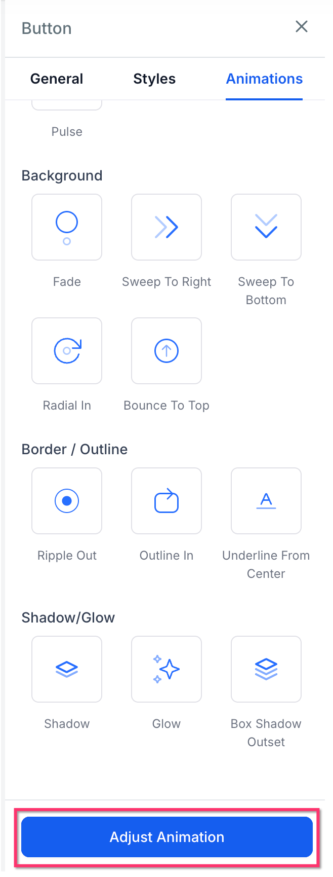
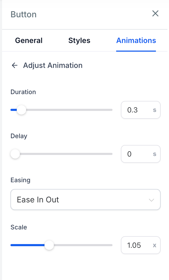
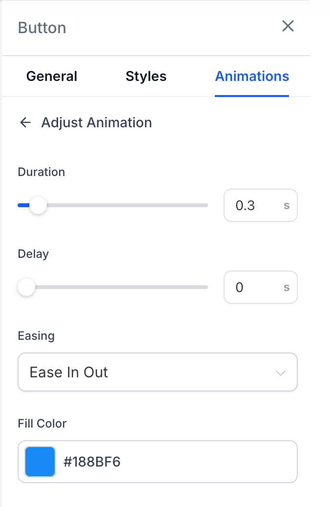
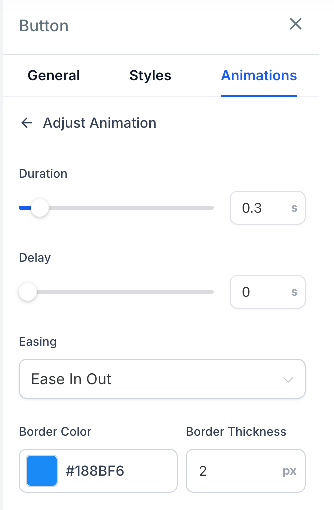
Configure Duration, Delay, Easing, and any additional settings available for the selected effect.
Preview the Button on the canvas and publish the page when the interaction looks correct.
Note: If the Button also has an entrance animation, the hover animation becomes active after the entrance animation finishes.
Note: Hover animations are automatically disabled on touch devices and screens under 1024px to prevent visitors from becoming stuck in a hover state.
Note: When the same Button appears in repeated page experiences, such as sticky bars or navigation clones, the repeated instances use the same hover animation as the original Button.
Customize Hover Animation Settings
Each hover effect includes timing controls, while additional settings appear based on the selected effect. This keeps the adjustment panel focused on settings that affect the animation you are using.
All supported Button hover effects include:
Duration: Sets how long the hover animation takes to complete. Available values range from 0.1 to 3 seconds.
Delay: Sets how long HighLevel waits before starting the hover effect. Available values range from 0 to 5 seconds.
Easing: Controls how the animation accelerates and slows. Available options include Linear, Ease In, Ease Out, and Ease In Out.
Additional controls depend on the selected hover effect:
| Effect Group | Examples | Additional Controls |
|---|---|---|
| Scale | Grow, Shrink, Pulse, Bounce In | Scale (0.5×–2×) |
| Rotation | Rotate, Skew Forward | Angle (−180° to 180°) |
| Movement | Float, Wobble Horizontal, Buzz | Distance (0–50) |
| Background | Fade, Sweep To Right, Sweep To Bottom, Radial In, Bounce To Top | Fill Color |
| Border / Outline | Ripple Out, Outline In, Underline From Center | Border Color, Border Thickness (1–10px) |
| Shadow / Glow | Shadow, Glow, Box Shadow Outset | Shadow Color, Blur (0–50px), Spread (0–50px) |
Frequently Asked Questions
Q: Do I need any prior experience with animations to use this feature?
A: No. Animation controls are available directly in the Page Builder, with previews and clearly labeled settings for configuring supported effects.
Q: What types of animations can I apply?
You can apply available entrance animations to supported page elements. Button elements also support configurable hover animations with controls for timing and effect-specific properties.
Q: Can I preview animations before publishing?
Yes. Animation settings preview inside the Page Builder. For Button hover animations, you can also hover over an effect card to preview that effect on the selected Button before applying it.
Q: What does easing do in an animation?
Easing determines how the animation accelerates and slows during playback. You can choose Linear, Ease In, Ease Out, or Ease In Out.
Q: Can a Button use both an entrance animation and a hover animation?
Yes. A Button can use an entrance animation and a hover animation. When both are configured, the hover animation becomes active after the entrance animation finishes.
Q: Do Button hover animations work on touch devices and smaller screens?
Hover animations are automatically disabled on touch devices and screens under 1024px so visitors do not become stuck in a hover state.
Related Articles
- Navigation Menus in the HighLevel Funnel Builder
- Scroll to Elements or Sections in Websites or Funnels
- How to Create Multiple Popups Per Page for Funnels and Websites
Was this article helpful?
That’s Great!
Thank you for your feedback
Sorry! We couldn't be helpful
Thank you for your feedback
Feedback sent
We appreciate your effort and will try to fix the article