Device Width Preview gives you more control when reviewing responsive Funnel and Website pages inside the HighLevel builder. Enter an exact pixel width to see how your page looks at different screen sizes while staying within the selected desktop, tablet, or mobile breakpoint. The preview changes only the builder canvas and does not alter saved styles or the published page.
TABLE OF CONTENTS
- What Is Device Width Preview?
- Prerequisites and Limitations
- Supported Device Width Ranges
- How to Use Device Width Preview
- Adjust Row & Column Widths in Desktop & Tablet Views
- Frequently Asked Questions
- Related Articles
What Is Device Width Preview?
Device Width Preview lets you enter an exact pixel width for the Funnel and Website Builder canvas.
Instead of reviewing your design at only one predefined canvas width, you can test different widths within the selected desktop, tablet, or mobile breakpoint.
The custom width changes only the canvas preview. Your selected device mode still determines which responsive styles you edit and save.
Prerequisites and Limitations
Device Width Preview is designed for responsive testing inside the builder. Understanding how it interacts with device modes helps prevent preview changes from being confused with responsive styling changes.
Keep the following behaviors in mind:
- Device Width Preview changes only the builder canvas preview.
- It does not create a new responsive breakpoint.
- The selected Desktop, Tablet, or Mobile mode determines which responsive styles are edited and saved.
- Custom preview widths apply only to the current builder session.
- Custom widths reset when you reload the builder or navigate to another page.
- Preview widths are not saved in page data.
- Preview widths do not change the published page.
- Preview widths do not generate or apply separate responsive styles.
- The width you enter must fall within the supported range for the selected device mode.
Supported Device Width Ranges
Each device mode supports a defined range of preview widths. Select the appropriate device mode before entering a custom width.
| Device Mode | Supported Width |
|---|---|
| Desktop | 1025–3000 px |
| Tablet | 768–1024 px |
| Mobile | 320–767 px |
Entering a width outside the selected device mode's range displays inline validation feedback.
How to Preview Device Width
Device Width Preview is available directly in the Funnel and Website Builder. Open the page you want to review, select the appropriate responsive mode, and enter the screen width you want to preview.
Step 1: Open a Funnel or Website Page
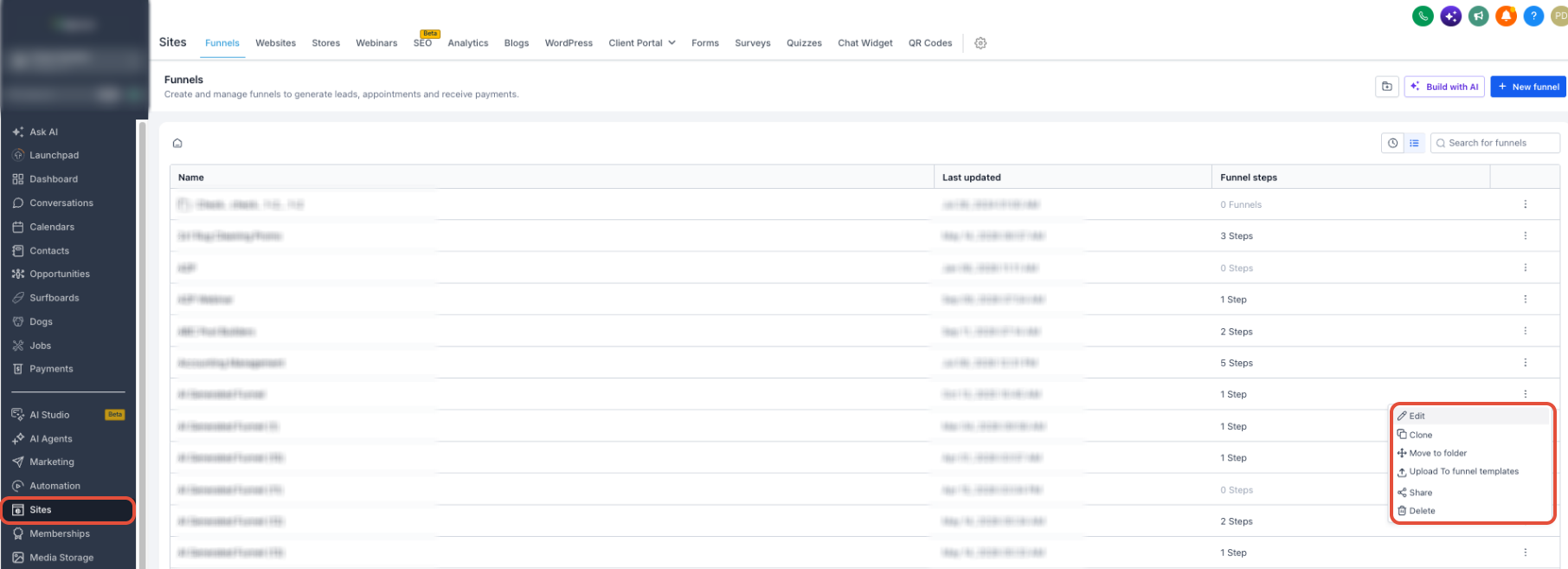
- From the Sub-Account View, select Sites in the left menu.
- Select Funnels or Websites.
- Open the Funnel or Website you want to edit.
- Open the applicable step or page in the builder.
Step 2: Select a Device Mode
Choose the responsive breakpoint you want to review:
- Desktop
- Tablet
- Mobile
The selected device mode determines which responsive styles are active while you edit the page.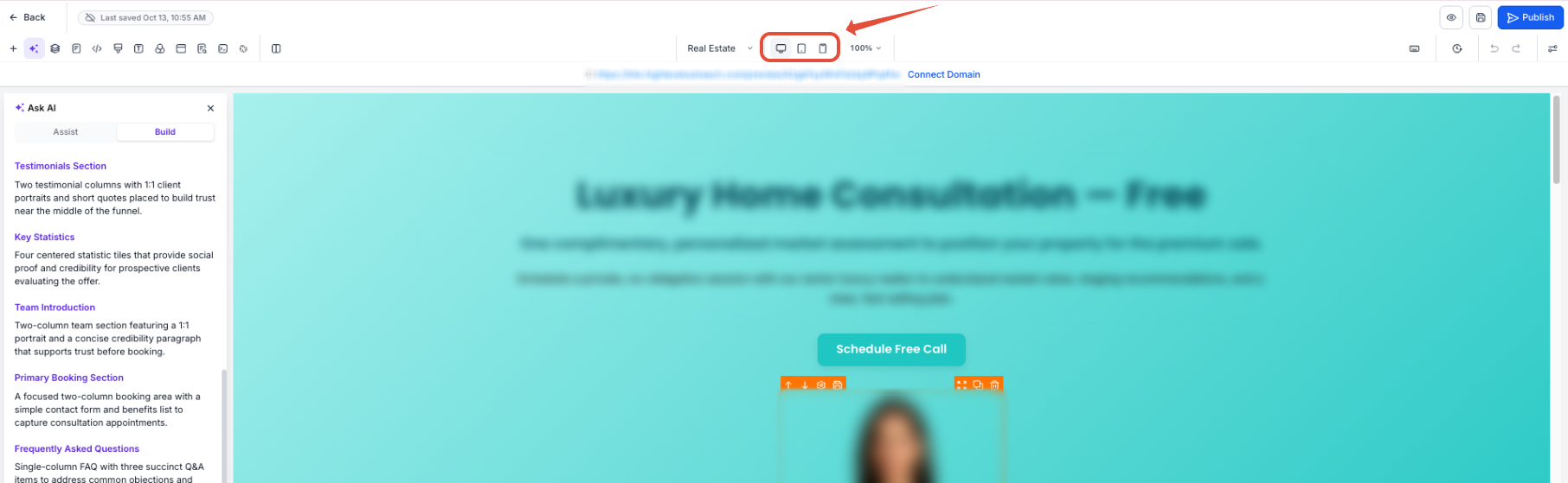
Step 3: Enter a Custom Device Width
Locate the Device Width control beside the device switcher.
Enter a pixel width that falls within the supported range for the selected device mode.
For example, when Tablet is selected, enter a value between 768 px and 1024 px.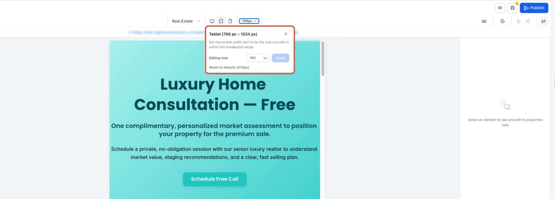
Step 4: Apply the Preview Width
Apply the entered width by either:
- Clicking Apply
- Pressing Enter
The builder canvas updates to the requested width while remaining within the selected responsive breakpoint.
Step 5: Review the Page Layout
Review how your sections, rows, columns, elements, spacing, and content appear at the selected width.
If the canvas becomes wider than the available builder workspace, scroll horizontally to review the full layout.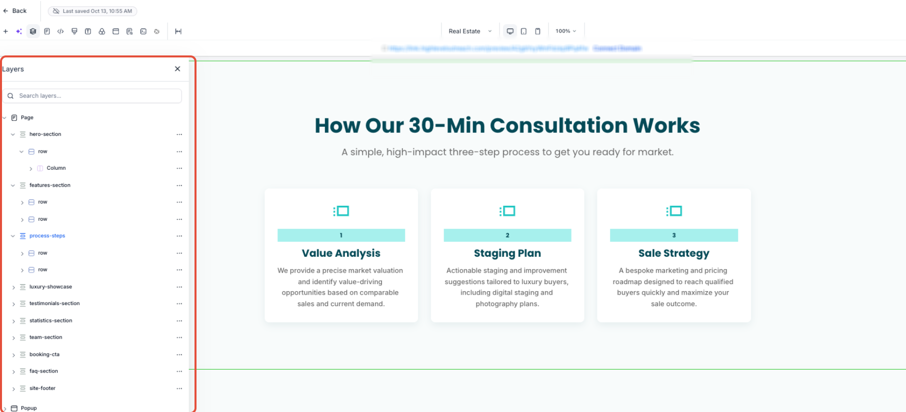
Step 6: Test Additional Widths
Enter additional supported widths to test how the layout responds across the selected breakpoint.
If you need to test another breakpoint, switch to Desktop, Tablet, or Mobile, then enter a width supported by that mode.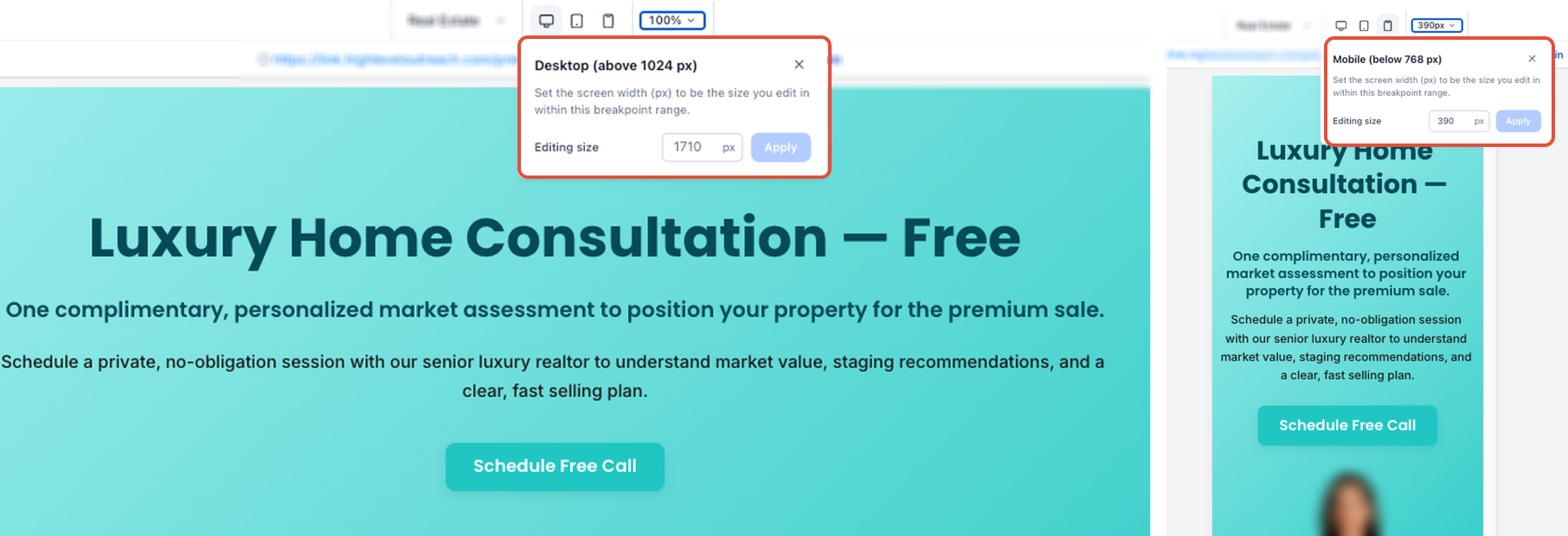
Step 7: Reset the Preview
Use the reset option to return the canvas to the default preview width for the active device mode.
Resetting the preview width does not change the responsive styles you have already edited or saved.
Adjust Row & Column Widths in Desktop & Tablet Views
The Funnel and Website Builder allows you to customize row and column widths separately for Desktop and Tablet views. By default, Tablet inherits Desktop widths until you customize them.
How to Adjust Row and Column Widths
Open a funnel or website page in the builder.
Use the device switcher to select Desktop or Tablet view.
Select a row and adjust its width using the Width setting.
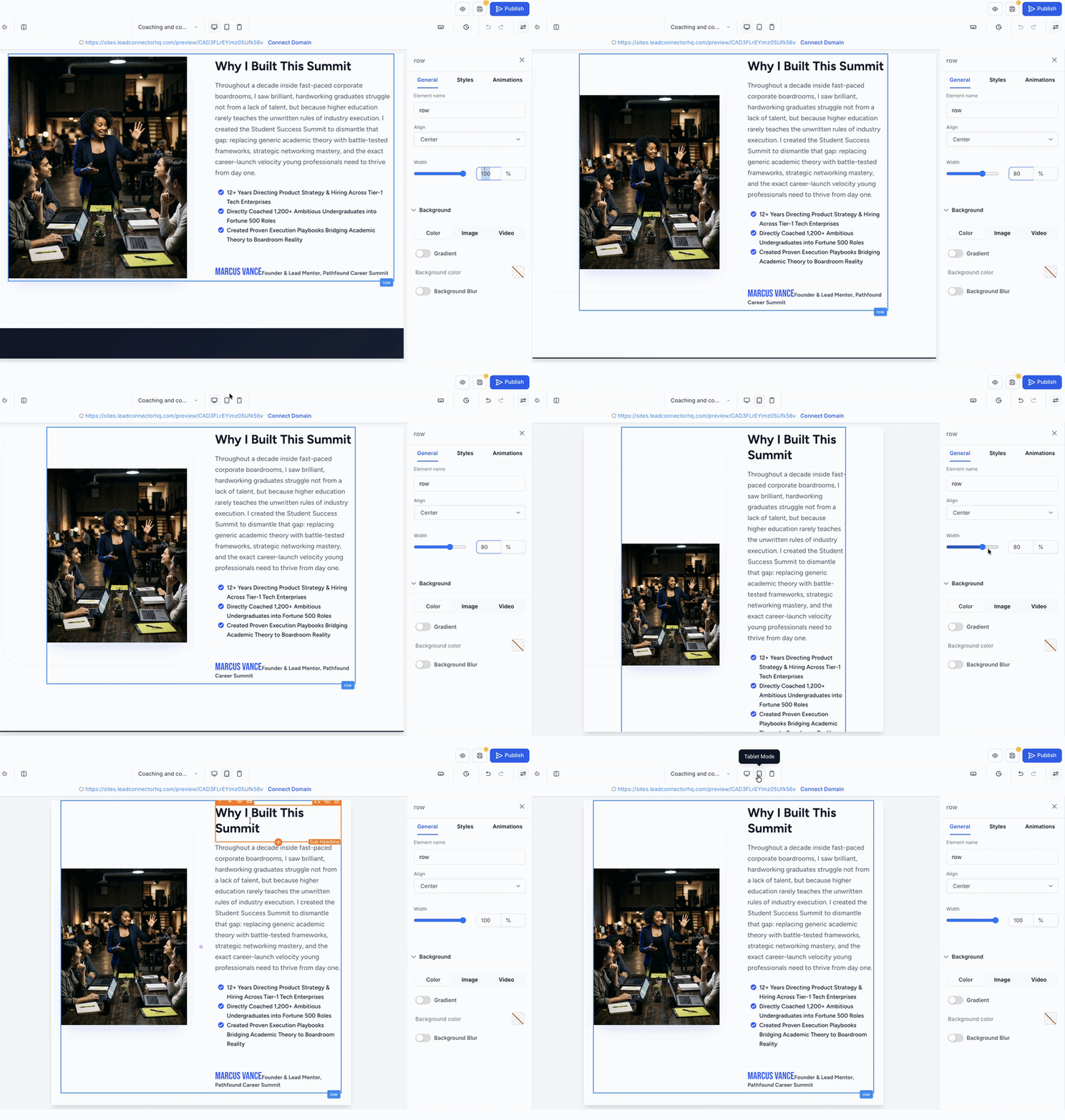
To resize adjacent columns in Tablet view, drag the handle between the columns to adjust their widths.
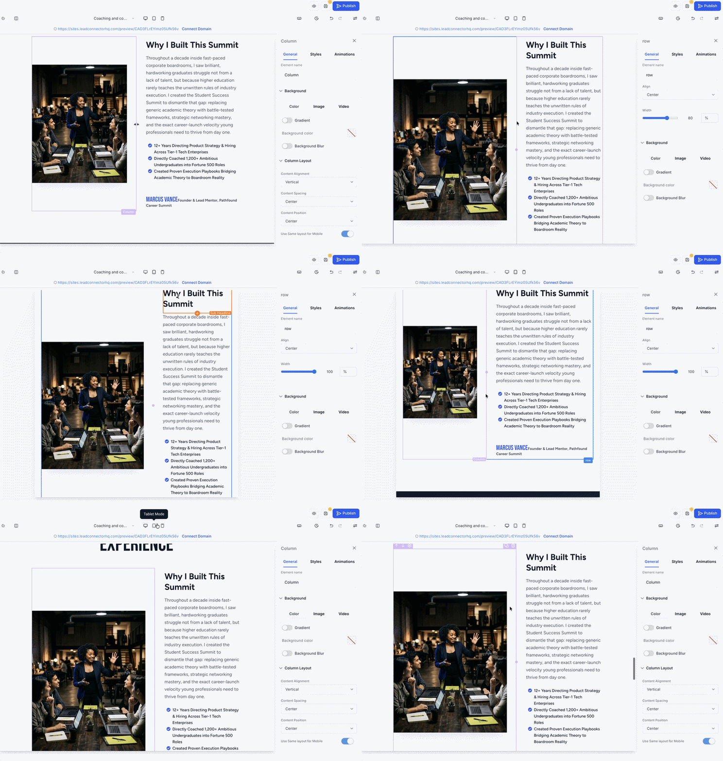
Switch between Desktop and Tablet views to review your layouts, then save your changes.
Note: Changes made to Tablet widths do not affect the Desktop layout. Tablet-specific widths are retained after saving and reloading the builder.Important Notes:
Width inheritance: Tablet inherits Desktop row and column widths until customized.
Reset Tablet row width: Set the Tablet row width to match the Desktop value to remove the override and restore inheritance.
Mobile view: Rows remain full width, the row-width control stays hidden, and columns stack vertically.
Existing pages: Pages without Tablet-specific widths remain unchanged. No migration is required.
Frequently Asked Questions
Q: Does entering a custom Device Width create a new breakpoint?
No. Device Width changes only the canvas preview. Desktop, tablet, and mobile remain the responsive breakpoints used for editing and saving styles.
Q: Does the custom preview width affect my published page?
No. Preview widths are not saved in page data and do not affect the published page or its generated styles.
Q: Will my custom Device Width be saved for the next time I open the builder?
No. Custom preview widths are session-only and reset after reloading the builder or navigating to another page.
Q: What happens if I enter a width outside the selected breakpoint's range?
The builder displays inline validation feedback. Enter a width within the supported range for the selected device mode.
Q: Can I preview a width that is larger than my available builder workspace?
Yes. When the canvas exceeds the available workspace, you can scroll horizontally to review the full preview.
Q: Does changing the Device Width change which responsive styles I am editing?
No. The selected desktop, tablet, or mobile mode determines which responsive styles are edited and saved.
Related Articles
Was this article helpful?
That’s Great!
Thank you for your feedback
Sorry! We couldn't be helpful
Thank you for your feedback
Feedback sent
We appreciate your effort and will try to fix the article